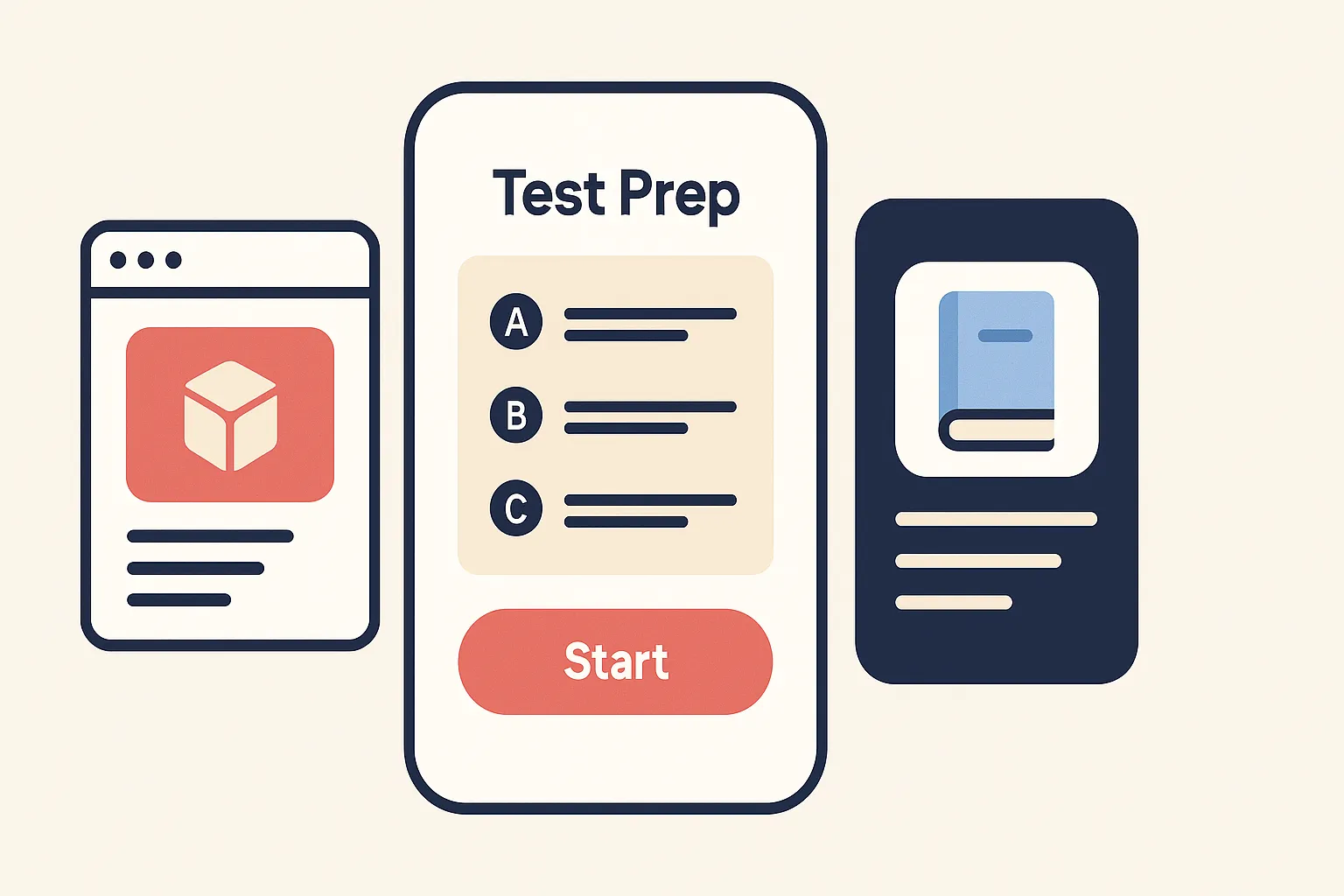
- 1. Exams Have Gone Mobile
- 2. The Rise of the Mobile Test Taker
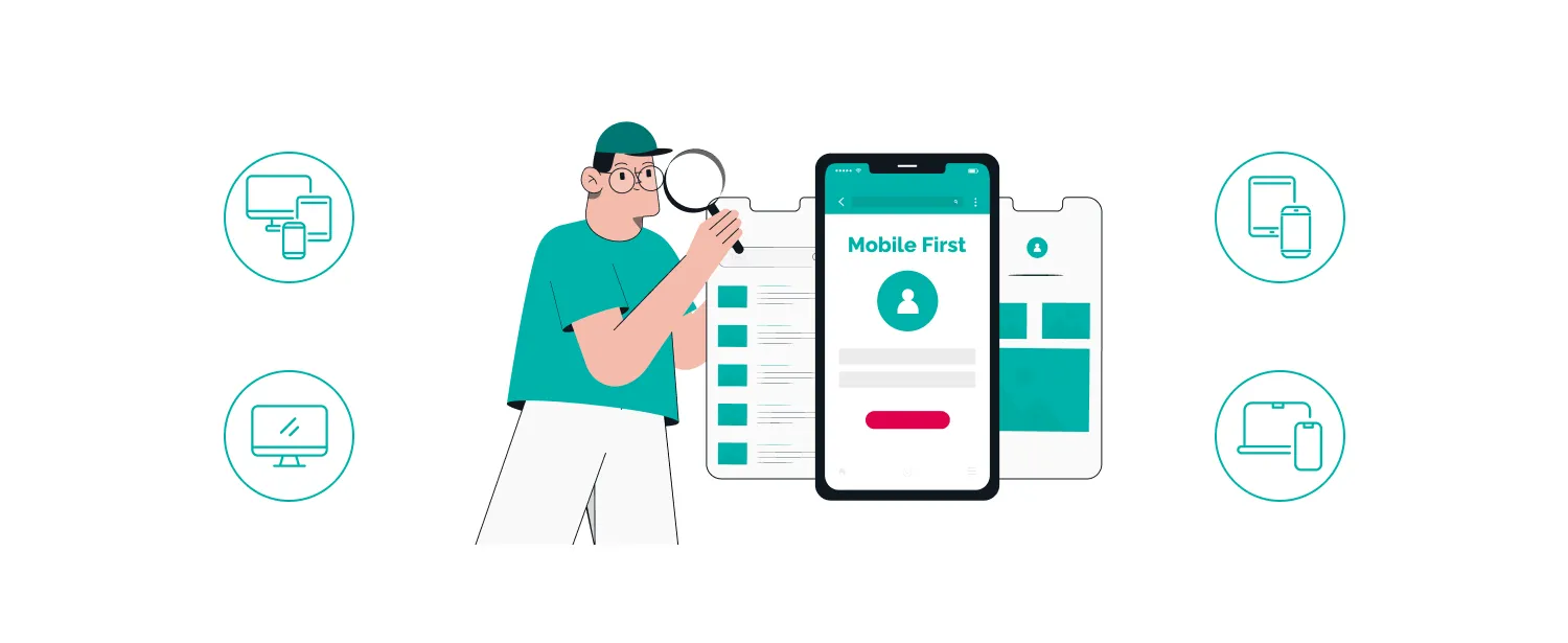
- 3. What “Mobile-First” Actually Means
- 4. Why Device Compatibility Is Non-Negotiable
- 5. Key Compatibility Challenges to Solve
- 6. Designing Exam Content for Small Screens
- 7. Proctoring and Security on Mobile
- 8. How OnlineExamMaker Powers Mobile-First Assessments
- 9. Best Practices for Institutions and EdTech Teams
- 10. Measuring Success
- 11. Conclusion
1. Exams Have Gone Mobile
Remember when taking an exam meant sitting at a designated desktop computer in a quiet lab? Those days feel almost quaint now. Assessments have quietly followed learners into their pockets — onto the bus, into the break room, across time zones. Students fire up quiz apps between classes. Remote employees complete compliance certifications on their phones during lunch. Corporate trainers push assessments that must work on a warehouse floor, not just a nice office desk.
The shift is real, and it’s accelerating. A mobile-first mindset is no longer a bonus feature — it’s a baseline requirement for fairness, accessibility, and healthy completion rates. If your exam breaks on a mid-range Android phone, you haven’t just created a bad user experience; you’ve potentially disadvantaged an entire segment of your test population.
2. The Rise of the Mobile Test Taker
Here’s a scenario that plays out thousands of times a day: a working parent, commuting home on a packed train, pulls out their phone to complete a certification exam before the deadline. Their laptop is at the office. Their desktop is at home. Their phone is right there.
This isn’t an edge case — it’s a majority use case for a growing slice of learners. In many developing markets, smartphones are the primary internet-connected device, full stop. Even in well-resourced environments, shared home computers and corporate IT restrictions push people toward mobile.
Typical mobile-exam scenarios include:
- Students commuting or studying between classes
- Remote and field workers completing required compliance training
- Adult learners juggling jobs and coursework, grabbing time wherever they find it
- Learners in rural or low-bandwidth regions relying on mobile data
Ignoring these realities doesn’t make them go away. It just means lower completion rates, more support tickets, and frustrated learners who feel the system wasn’t built for them.
3. What “Mobile-First” Actually Means
There’s a common misconception here worth clearing up. Mobile-first doesn’t mean mobile-only. It means you design for the smallest screen and most constrained interaction model first — touch, limited real estate, slower connection — and then progressively enhance the experience for tablets and desktops.
In practice, mobile-first exam design translates to:
- Responsive layouts that reflow gracefully across screen sizes
- Minimal scrolling per question, keeping content digestible
- Thumb-friendly UI with large tap targets and generous spacing
- Clear typography — readable font sizes, strong contrast, no tiny print
- Simple navigation — forward, back, flag for review, submit. Nothing cryptic.
The irony is that designing well for mobile almost always improves the desktop experience too. Constraints breed clarity.
4. Why Device Compatibility Is Non-Negotiable

Imagine spending weeks preparing for a high-stakes certification exam, only to watch your test platform crash on exam day because your phone’s OS version wasn’t quite right. That’s not a hypothetical — it happens, and it’s genuinely damaging to learners and institutions alike.
Device compatibility matters for three core reasons:
| Reason | Impact |
|---|---|
| Equity & Access | Exams must work across a realistic range of devices, OS versions, and browsers so no learner is disadvantaged by their hardware. |
| Reliability & Performance | Crashes, lag, and broken layouts spike test anxiety, distort timing data, and undermine the validity of scores. |
| Security & Proctoring | Camera, mic, and network requirements vary by device. Compatibility gaps can silently block exam participation before a question is even answered. |
5. Key Compatibility Challenges to Solve
The mobile device landscape is gloriously, painfully diverse. Android alone runs across thousands of hardware configurations. iOS has its own quirks. Browsers behave differently. Networks vary wildly. Here’s where things tend to break:
- Device diversity: Screen sizes, resolutions, RAM, and processor speeds differ dramatically even within the same price tier. A layout that looks crisp on a flagship phone can collapse on a budget device.
- OS and browser fragmentation: Android and iOS handle media permissions, notifications, and accessibility features differently. So does Chrome versus Safari versus Firefox Mobile.
- Network conditions: Mobile data is inconsistent. An exam that loads fine on Wi-Fi may time out or lose state on a 3G connection in a rural area.
- Interaction patterns: Touch gestures, virtual keyboards, auto-rotate, and pinch-to-zoom can all interfere with careful question answering if the platform hasn’t accounted for them.
None of these are impossible problems. But they require intentional testing and design, not assumptions.
6. Designing Exam Content for Small Screens
Not all question types age well on mobile. A dense passage with a 12-column comparison table might be brilliant on a 27-inch monitor and absolutely miserable on a 5-inch phone. Content design has to keep pace with the delivery format.
Question formats that thrive on mobile:
- Concise multiple-choice questions (MCQs)
- True/False items
- Short answer fields
- Simple image-based questions
Design pitfalls to avoid:
- Long reading passages that require constant scrolling or zooming
- Multi-column layouts that break on narrow screens
- Drag-and-drop interactions that are unreliable with touch
- Tiny checkboxes or radio buttons that require fingertip precision
Accessibility isn’t an afterthought here — it’s the design. Readable fonts, strong contrast ratios, larger tap targets, and support for screen readers all make exams better for everyone, not just users with disabilities.
7. Proctoring and Security on Mobile
Mobile proctoring has come a long way. Modern platforms can use a phone’s front-facing camera and microphone for live or AI-powered monitoring, which is remarkable when you think about it — a device that fits in your pocket can now serve as a full exam environment complete with identity verification.
But this comes with real requirements. Devices need a working camera, a reasonably recent OS, and a stable enough connection to stream data. Compatibility gaps at the hardware or software level can quietly block a student from even entering the exam room.
There’s also the question of balance. AI proctoring systems have to be calibrated carefully. A student glancing down at their keyboard shouldn’t trigger a cheating flag. A brief connectivity hiccup shouldn’t be treated as suspicious behavior. Institutions should review flagged incidents with human judgment, not just automated decisions.
For learners who genuinely can’t meet mobile proctoring requirements — an old device, no reliable camera — offering desktop or in-person alternatives isn’t a workaround. It’s a fairness obligation.
8. How OnlineExamMaker Powers Mobile-First Assessments
This is where theory meets a platform that actually delivers on it. OnlineExamMaker was built with modern, device-agnostic assessment in mind — whether your learners are at a desktop in a corporate office or on a smartphone on a factory floor.
A few standout features worth knowing about:
- AI Question Generator: Create exam questions in seconds from your existing content. Great for HR managers and trainers who need to build assessments quickly without a dedicated instructional design team.
- Automatic Grading: Exams are scored instantly, freeing up time and eliminating manual grading errors — especially useful for large-scale enterprise certification programs.
- AI Webcam Proctoring: AI-powered monitoring works across devices, including mobile, keeping assessments secure without requiring learners to physically come in.
The platform supports both cloud-based and on-premise deployment, so institutions with strict data governance requirements aren’t left out. And it’s genuinely free to get started — no credit card required.
Create Your Next Quiz/Exam Using AI in OnlineExamMaker
9. Best Practices for Institutions and EdTech Teams
Good intentions don’t survive contact with exam day without solid preparation. Here’s what actually works:
- Run mock exams before the real thing. Give students a practice test that mirrors the real environment — same platform, same device, same proctoring setup. Catch problems 48 hours before the deadline, not during it.
- Publish clear technical requirements upfront. Device minimums, OS versions, browser recommendations, bandwidth expectations, allowed accessories — put it all in writing and make it easy to find.
- Offer multiple access options. Mobile and desktop should both work well. Design for mobile first, but never artificially restrict desktop users.
- Maintain a compatibility log. Track which devices and OS versions your learners are actually using (analytics help here). Update your compatibility matrix regularly — what worked fine 18 months ago may have issues today.
- Have a contingency plan. What happens if a student’s connection drops mid-exam? What if the app crashes? Clear, published procedures reduce panic and protect learner outcomes.
10. Measuring Success
How do you know if your mobile-first exam design is actually working? You measure it. Specifically:
- Completion rates by device type — Are mobile users finishing at the same rate as desktop users? A gap here signals a problem.
- Drop-off points — Where are people abandoning the exam? Question 3? The login screen? The camera permission dialog?
- Time-on-question — Unusually long time on a specific question might indicate a rendering issue on certain devices.
- Support ticket frequency — Spikes in device-related support requests are a leading indicator of compatibility problems.
- Post-exam surveys — Ask learners directly. “Did you experience any technical issues?” is a simple question that surfaces things analytics can’t catch.
Use heatmaps and session recordings (where privacy rules permit) to identify exactly where the experience breaks down. The data makes the next iteration better.
11. Conclusion
Mobile-first exam design isn’t a trend to get ahead of — it’s already the present reality for a large portion of learners. The question isn’t whether your assessments need to work on mobile. They do. The question is whether you’ve designed them to do so gracefully, equitably, and securely.
For teachers, trainers, HR managers, and enterprise teams, the good news is that platforms like OnlineExamMaker have done much of the heavy lifting. AI-generated questions, automatic grading, mobile-compatible proctoring — the infrastructure exists. What’s left is using it intentionally, testing it rigorously, and keeping your learners at the center of every design decision.
Because at the end of the day, an exam that doesn’t work on the device your learner has isn’t really an exam. It’s a barrier.