Google Forms makes theme customization surprisingly painless. No design degree required, no coding skills needed—just a few clicks and you’ve transformed your quiz from “meh” to magnificent. Whether you’re branding a corporate training module or adding personality to a classroom quiz, customization is your secret weapon.
- What Is Theme Customization in Google Forms?
- Getting Started: Accessing the Theme Editor
- Playing with Colors (Without Going Overboard)
- Adding Header Images That Pop
- Choosing Fonts That Don’t Make People Squint
- Pro Tips for Quiz Theme Consistency
- Beyond Google Forms: Meet OnlineExamMaker
What Is Theme Customization in Google Forms?
You might think, “It’s just a quiz—does anyone really care about colors?” The answer is yes. Absolutely yes.
First impressions count. When a learner opens your quiz and sees thoughtful design, they subconsciously perceive it as more credible and worth their time. Conversely, a generic form screams “I threw this together in five minutes,” even if you spent hours crafting brilliant questions.
Here’s another angle: visual consistency builds trust. If you’re running multiple quizzes throughout a course or training program, maintaining the same color scheme and style creates a cohesive learning experience. Students recognize your quizzes instantly, which reduces cognitive load and helps them focus on what matters—the content.
Plus, let’s not forget accessibility. Customizing fonts and colors thoughtfully can make your quiz more readable for people with visual impairments or learning differences. It’s not just about looking good; it’s about being inclusive.
Getting Started: Accessing the Theme Editor
Ready to dive in? Open your Google Forms quiz—yes, the one you’ve already created or are about to create. Look toward the top-right corner of your screen. See that little palette icon? That’s your gateway to customization heaven. Click it.
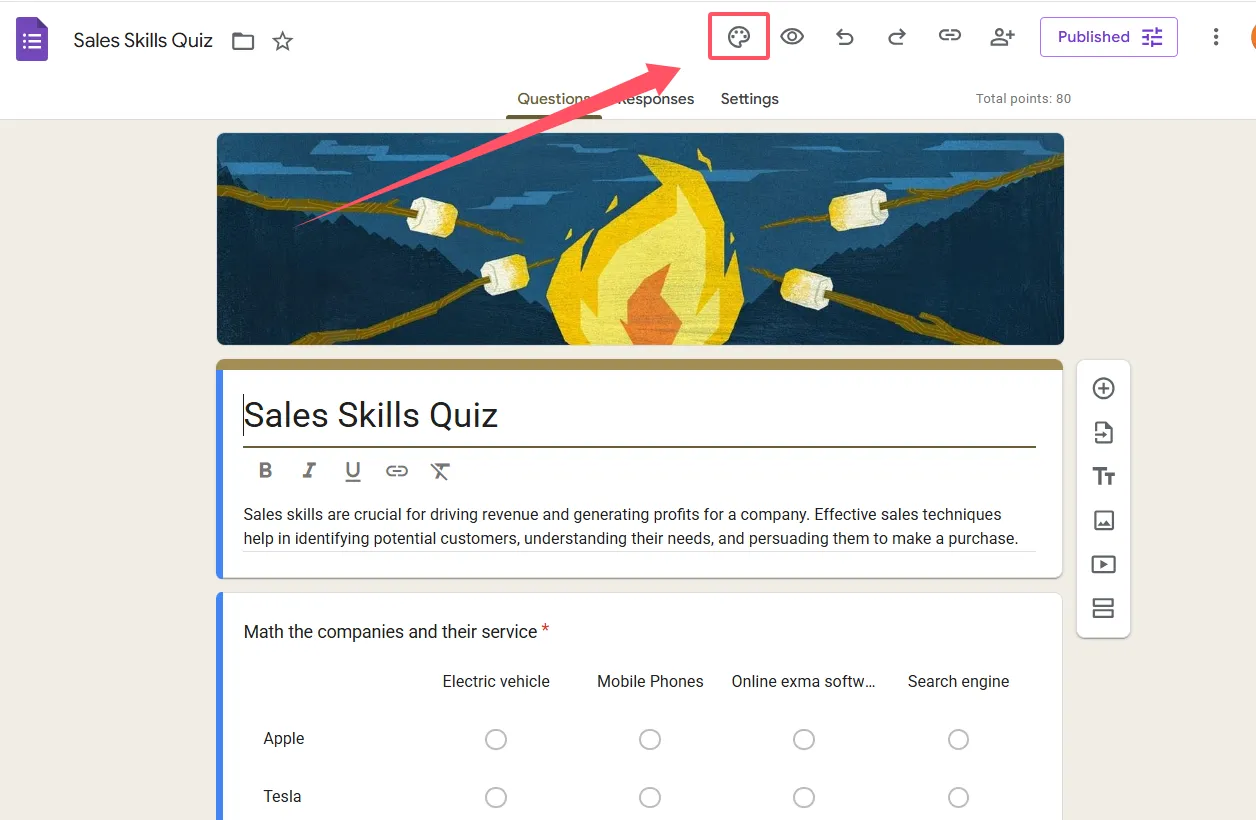
A sidebar will slide open from the right, revealing all your theme options. This is where the magic happens. The beauty of Google Forms’ theme editor is its real-time preview capability. Every change you make appears instantly in the background, so you can see exactly how your quiz will look before committing. No guesswork, no surprises.
One thing to note: these customization options work identically whether you’re creating a quiz or a standard form. Google doesn’t discriminate between assessment types, which means you can apply the same design principles across all your Forms projects.
Playing with Colors (Without Going Overboard)
Color is where most people start, and for good reason—it’s the most dramatic visual change you can make. In the theme sidebar, you’ll see a theme color option. This color affects buttons, question titles, and various accents throughout your quiz.
Google provides a preset palette of colors to choose from, but here’s where it gets fun: click the “+” icon to access a custom color picker. Want your quiz to match your school colors exactly? Go for it. Need to align with corporate branding guidelines? Done.
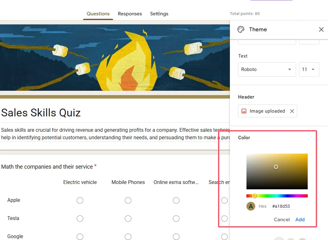
But hold on—before you choose neon pink with lime green accents, remember this golden rule: readability trumps creativity. Your theme color should provide sufficient contrast against the background. If learners are squinting to read question text, you’ve defeated the purpose.
Speaking of backgrounds, you can also select complementary background colors that work with your chosen theme. Google automatically suggests shades that play nicely together, which takes the guesswork out of color theory. Not an artist? Let Google do the heavy lifting.
Quick Color Psychology Tip
Different colors evoke different emotions. Blue conveys trust and calmness—great for professional assessments. Green suggests growth and learning—perfect for educational quizzes. Red creates urgency—useful for time-sensitive tests, but use sparingly. Yellow feels cheerful but can strain eyes if overused. Choose colors that align with your quiz’s purpose and audience.
Adding Header Images That Pop
Now we’re getting to the fun part. A header image can transform your quiz from functional to fantastic in seconds. In the theme sidebar, look for the header section and click “Choose image.”
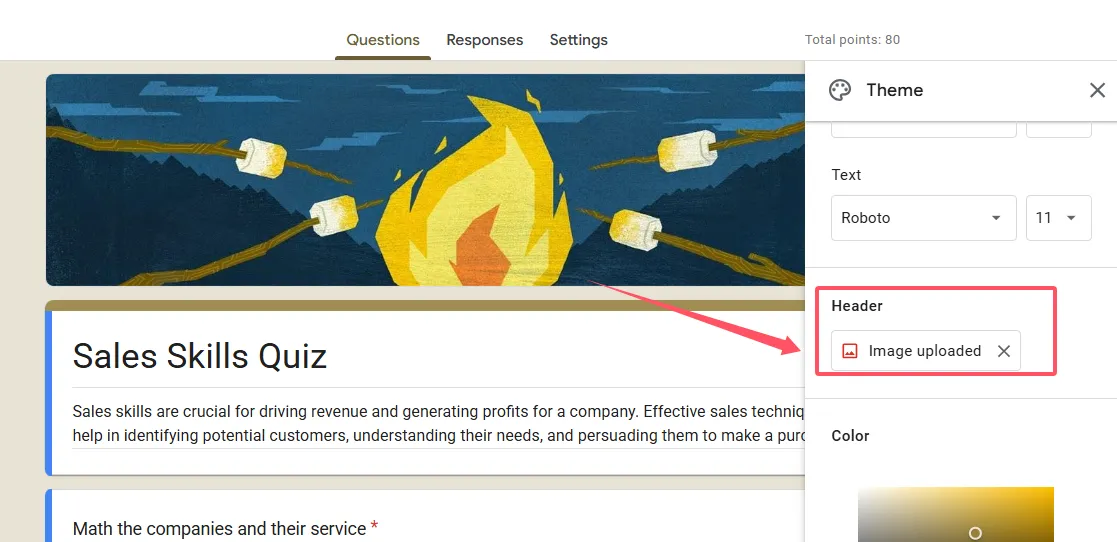
You’ve got options here. Upload an image from your device, pull one from your Google Photos library, or browse Google’s default collection. If you’re going custom (which I recommend for maximum impact), aim for an image that’s 1600×400 pixels. This dimension ensures your header looks crisp without awkward cropping or stretching.
What makes a good header image? It should be relevant to your quiz topic, visually appealing, and not too busy. Remember, this image sits at the top of your form, so it needs to complement—not compete with—your content. A simple, bold image works better than a cluttered one.
Here’s a pro move: if you’re creating a series of quizzes on related topics, use variations of the same header style. Maybe it’s the same background with different text overlays, or a consistent color scheme with topic-specific icons. This creates visual continuity across your entire quiz collection.
Choosing Fonts That Don’t Make People Squint
Typography might seem like a minor detail, but poor font choices can sabotage even the best quiz. Google Forms offers several font combinations under the Text section of your theme editor. You can customize three elements: header font, question font, and regular text font.
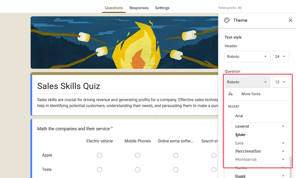
The preset options have names like “Basic,” “Playful,” “Formal,” and others. These aren’t just random labels—they’re designed to evoke specific moods. “Basic” keeps things clean and professional. “Playful” adds personality without sacrificing readability. “Formal” works for serious assessments like certification exams.
My advice? Prioritize readability over style, especially for quizzes. Your learners need to quickly scan questions and answers, not decode decorative fonts. Sans-serif fonts (like Arial or Helvetica) generally work better on screens than serif fonts (like Times New Roman), though Google’s combinations are already optimized for digital reading.
You can also adjust font sizes, but be cautious. Too small, and you’re creating accessibility barriers. Too large, and your quiz feels like it’s shouting. Stick close to the defaults unless you have a specific reason to change.
Accessibility Check
Before finalizing your font choices, test your quiz in preview mode. Better yet, ask a colleague or student to review it. What looks fine on your 27-inch monitor might be challenging on a smartphone screen. Make sure your text remains legible across different devices and screen sizes.
Beyond Google Forms: Meet OnlineExamMaker AI Quiz Maker
While Google Forms is fantastic for basic quiz customization, some educators and trainers eventually outgrow its capabilities. If you’re looking for more advanced features—particularly AI-powered tools—it’s worth exploring alternatives like OnlineExamMaker.
OnlineExamMaker takes quiz creation to another level with AI-powered features that save enormous amounts of time. Its AI question generator can create assessment questions based on your content, which is a game-changer when you’re building large question banks. Instead of manually writing 100 questions, you can generate, review, and refine them with AI assistance.
Create Your Next Quiz/Exam Using AI in OnlineExamMaker
The platform also offers AI proctoring—a feature that monitors test-takers during online exams to maintain academic integrity. For high-stakes assessments or remote training programs, this adds a layer of security that Google Forms simply can’t provide.
Perhaps most impressively, OnlineExamMaker includes AI reporting that analyzes quiz results and provides insights into learner performance, question difficulty, and areas where students struggle most. Rather than manually combing through response data, you get actionable intelligence delivered automatically.
The theme customization in OnlineExamMaker is also more robust, offering additional design flexibility beyond what Google Forms allows. If you’ve mastered Google Forms customization and need more control, it’s a natural next step.
Final Thoughts
Customizing your Google Forms quiz theme isn’t rocket science, but it does make a difference. In the five to ten minutes it takes to adjust colors, add a header image, and select appropriate fonts, you’re creating a more professional, engaging, and accessible learning experience.
Remember that good design serves the content, not the other way around. Your primary goal is always clear communication—helping learners understand questions and provide accurate answers. Theme customization should enhance that goal, removing friction and creating a pleasant environment for assessment.
Start simple. Pick a color scheme, add a relevant header image, and stick with readable fonts. Test your quiz on different devices. Gather feedback from actual users. Iterate and improve with each new quiz you create.
And when you’re ready to level up beyond basic customization, tools like OnlineExamMaker offer AI-powered features that can transform how you create, administer, and analyze assessments. But master the fundamentals first—they’ll serve you well regardless of which platform you ultimately choose.
Now stop reading and start customizing. Your learners will thank you for it.