Ever sat through a boring presentation and wished someone would just test whether you were paying attention? Well, here’s the twist: you can actually build that test right into PowerPoint. No fancy plugins, no coding gymnastics—just good old shapes, hyperlinks, and a dash of creative trigger magic.
Creating a multiple choice quiz in PowerPoint transforms static slides into interactive learning experiences. Whether you’re a teacher crafting engaging classroom activities, an HR manager developing training assessments, or a trainer building professional development modules, PowerPoint’s built-in features give you everything you need to build quizzes that actually work.
- Why Use PowerPoint for Quiz Creation?
- Setting Up Your Quiz Foundation
- Method 1: The Hyperlink Approach
- Method 2: Trigger Effects and Animations
- OnlineExamMaker: AI-Powered Multiple Choice Assessment Maker for Teachers
- Building Question Slides with Shapes
- Creating Feedback Mechanisms
- How to Make A Multiple Choice Assessment with OnlineExamMaker AI?
- Best Practices and Pro Tips to Create Multiple Quizzes
- Troubleshooting Common Issues
Why Use PowerPoint for Quiz Creation?
Here’s the thing about PowerPoint: everyone already has it. No need to convince your IT department to install specialized quiz software or wrestle with browser compatibility issues. PowerPoint sits there on virtually every work computer, waiting to be transformed from a presentation tool into an interactive assessment platform.
The beauty lies in the simplicity. You’re working with familiar tools—shapes, text boxes, animations—but combining them in ways that create genuine interactivity. Click a wrong answer? Get immediate feedback. Select the right one? Move forward with confidence. It’s the kind of instant gratification that keeps learners engaged, and you built it without writing a single line of code.
Setting Up Your Quiz Foundation in PowerPoint
Creating Your Title Slide
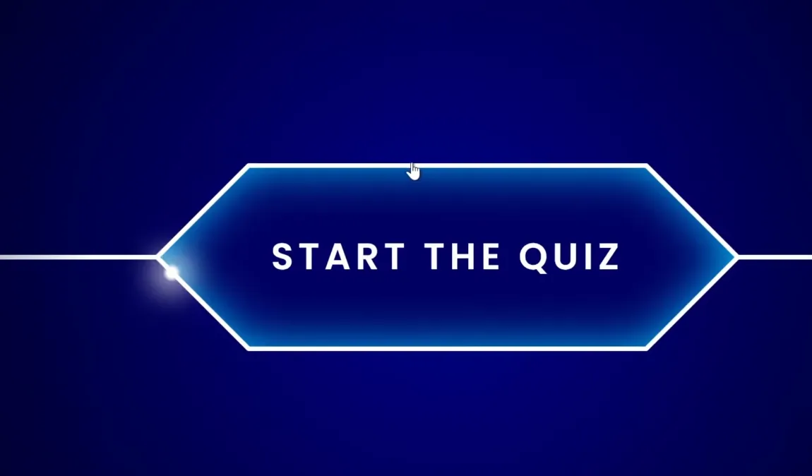
Start with intention. Your title slide isn’t just decoration—it’s the gateway to your quiz. Create a clean, inviting slide with a clear title (something like “Knowledge Check” or “Quick Assessment”) and a prominent Start button. This button will be your learner’s first interaction, so make it count.
Think about it like the front door to a house. You wouldn’t leave visitors standing on the porch wondering if they should knock, ring the doorbell, or just walk in. Same principle here. One clear call to action: Start the Quiz.
The Kiosk Mode Secret
Here’s where most people mess up, and it’s not their fault—it’s just not obvious. In normal PowerPoint mode, clicking anywhere advances the slide. That’s fine for presentations, but disastrous for quizzes. Imagine a learner accidentally clicking in the wrong spot and jumping ahead three questions. Chaos.
The fix? Kiosk mode. Navigate to Slide Show → Set Up Slide Show and select “Browsed at a kiosk (full screen)”. This single setting transforms your presentation from a passive slideshow into a controlled interactive experience. Now, only your designated buttons and triggers will advance the slides. Everything else? Just clicks into the void, harmless and ineffective.
Method 1: The Hyperlink Approach
The hyperlink method is your straightforward, no-nonsense option. Think of it as the reliable sedan of quiz-building techniques—not flashy, but it gets you where you need to go every single time.
Building the Question Slide
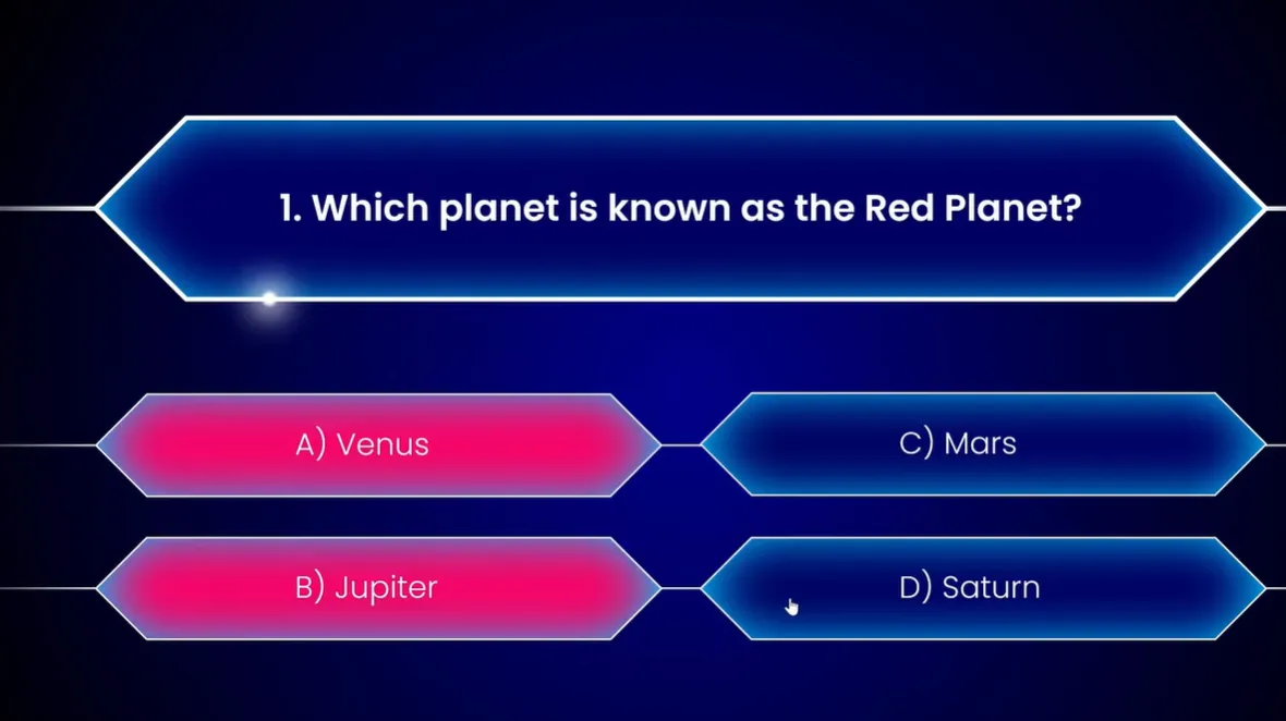
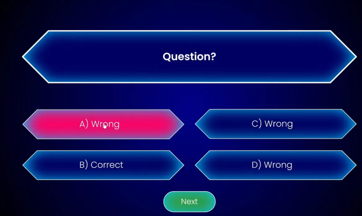
Start by typing your question at the top of a blank slide. Something clear and unambiguous. Then, create your answer options. You can use text boxes, but here’s a better idea: use shapes. Specifically, rectangles with rounded corners work beautifully as clickable buttons.
Insert four shapes (one for each answer option), arrange them in a grid, and add your answer text. Format them to look like actual buttons—maybe a subtle shadow, a border, colors that suggest “hey, click me.” Remember, visual design isn’t just about aesthetics; it’s about usability.
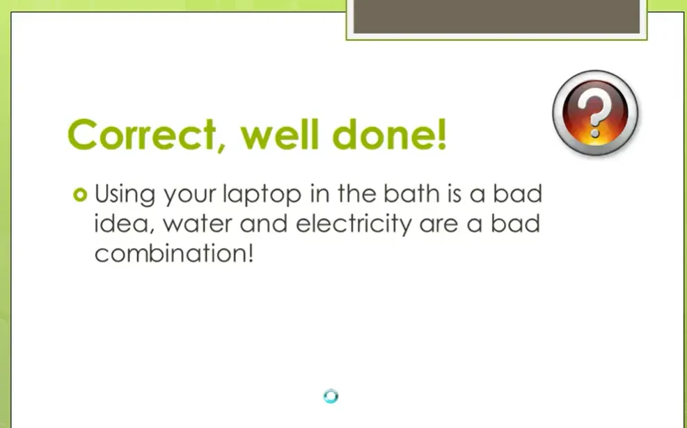
Creating Feedback Slides
After your question slide, insert two new slides: one for “Correct!” and one for “Try Again” (or “Incorrect” if you prefer bluntness). On each feedback slide, add a button—typically labeled “Next” for correct answers and “Retry” or “Back” for wrong answers.
The correct feedback slide should feel rewarding. Green colors, positive language, maybe even a sentence explaining why the answer is correct. The incorrect slide should be constructive—red colors sure, but also guidance. “Not quite” beats “WRONG” every time.
Linking It All Together
Now the magic. Select your correct answer shape on the question slide, go to Insert → Link (or right-click and choose “Link”), and set it to hyperlink to your “Correct!” slide. Do the same for each incorrect answer, but link those to your “Try Again” slide instead.
Test it. Enter slideshow mode (F5), click through your answers. Watch how the wrong answers all funnel to the same “Try Again” slide, while the correct answer jumps to success. It’s simple, it’s effective, and it works every single time.
Method 2: Trigger Effects and Animations
Now we’re getting somewhere interesting. The trigger method keeps everything on a single slide, using animations to reveal feedback based on what the learner clicks. It’s sleeker, more modern, and honestly? It feels a bit like magic when you first see it work.
Understanding Triggers
A trigger tells PowerPoint: “When someone clicks this specific thing, animate that specific thing.” It’s cause and effect, pure and simple. The brilliance is that you can have multiple triggers on one slide, each revealing different feedback.
Setting Up Answer Buttons
Create your question and answer shapes as before. But this time, you’ll also create feedback shapes on the same slide—small rectangles or text boxes that initially won’t be visible. One might say “Sorry, that’s not correct. Please try again” in red. Another says “That’s right! Click Next to continue” in green.
Here’s the clever bit: you’re going to hide these feedback boxes initially by setting them to appear only when triggered by clicking specific answer buttons.
Adding Animations and Triggers
Select your “incorrect” feedback box. Go to Animations → Add Animation → Appear. This tells PowerPoint how the feedback should show up. But we’re not done. Click Trigger → On Click of and select your first wrong answer shape from the list.
Repeat this process for each answer-feedback pair. Your correct answer should trigger both the correct feedback message and a “Next” button that appears to move forward.
The Color-Change Technique
Want to take it up a notch? Make the answer buttons themselves change color when clicked. Select your wrong answer button, add an animation called “Object Color” (you’ll find it under Emphasis effects), set the color to red, and—here’s the key—set it to trigger on click of itself.
Add a second animation: “Font Color” to keep the text readable as the background changes. Set both animations to start “With Previous” and keep the duration short—0.25 seconds snappy.
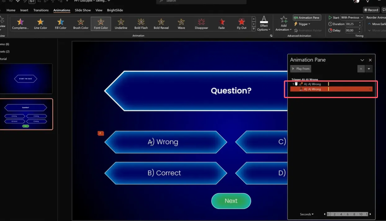
For correct answers, use green. It’s not just intuitive; it’s universally understood. Green means go, red means stop. Don’t overthink it.
OnlineExamMaker: AI-Powered Multiple Choice Assessment Maker for Teachers
OnlineExamMaker is an AI-powered assessment platform designed specifically for creating, distributing, and analyzing professional exams and quizzes. While PowerPoint handles the presentation side of assessments beautifully, OnlineExamMaker tackles the administrative and analytical challenges that come with serious testing.
The platform uses artificial intelligence to help educators and trainers build comprehensive assessments faster than traditional methods. Its powerful AI webcam proctoring system can help exam organizers prvent cheating activities during the online assessment with ease. It’s particularly valuable for HR managers conducting employee assessments, trainers developing certification programs, and teachers managing large student populations.
Create Your Next Quiz/Exam with OnlineExamMaker
Building Question Slides with Shapes
Let’s talk about making your quiz actually look good. Because functionality matters, but so does design. A well-designed quiz keeps people engaged; a ugly one makes them click away to check their email.
Choosing the Right Shapes
PowerPoint 2016 and later versions have a shape called “Rectangle: Diagonal Corners Snipped.” Find it under Insert → Shapes → Rectangles. This shape has two yellow handles you can drag to create diamond-like corners. It looks modern, professional, and distinctly “button-like.”
Alternatively, simple rounded rectangles work perfectly. The key is consistency—pick one style and stick with it throughout your quiz.
Formatting for Visual Appeal
Don’t settle for default blue shapes with black text. Create shapes that invite interaction:
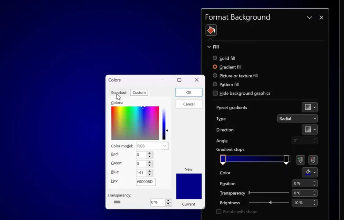
- Background color: Match your presentation theme, but ensure contrast with text
- Border: A 3-point white outline adds definition
- Shadow: A subtle inside shadow (40-point blur) creates depth
- Text: Use clean, readable fonts like Poppins or Arial at appropriate sizes
Copy the formatting from one shape to another using Format Painter (Ctrl+Shift+C to copy, Ctrl+Shift+V to paste). This ensures consistency across all answer options.
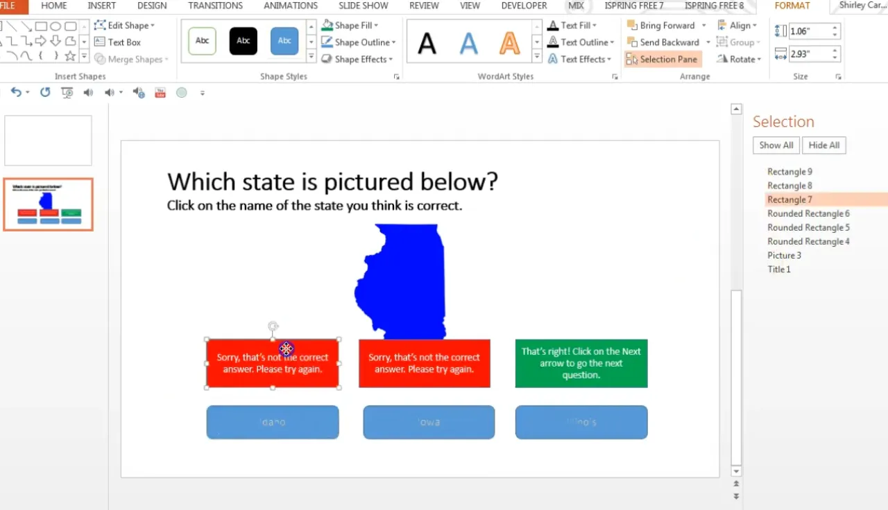
Using the Selection Pane
Here’s a pro tip that will save you countless headaches: use the Selection Pane. Press Alt+F10 to open it, and suddenly you can see every single object on your slide, properly labeled.
This matters enormously when you’re setting up triggers. PowerPoint auto-names shapes things like “Rectangle 4” and “Rounded Rectangle 7,” and trying to remember which is which while setting triggers is a recipe for confusion. The Selection Pane shows you everything at a glance.
Better yet, rename your shapes. Double-click a shape name in the Selection Pane and give it something meaningful: “Answer_A_Correct” or “Feedback_Wrong_2.” Your future self will thank you.
Creating Feedback Mechanisms
Feedback isn’t just about saying “right” or “wrong.” It’s about creating a learning moment. The difference between a mediocre quiz and a great one often comes down to how you handle feedback.
Immediate vs. Delayed Feedback
Immediate feedback—showing results right after each question—keeps momentum going. Learners get instant validation or correction, which research shows improves retention. This is what we’ve been building with our trigger and hyperlink methods.
Delayed feedback (showing results at the end) works better for formal assessments where you don’t want people changing answers based on what they’ve learned mid-quiz. Choose based on your goals.
Writing Effective Feedback
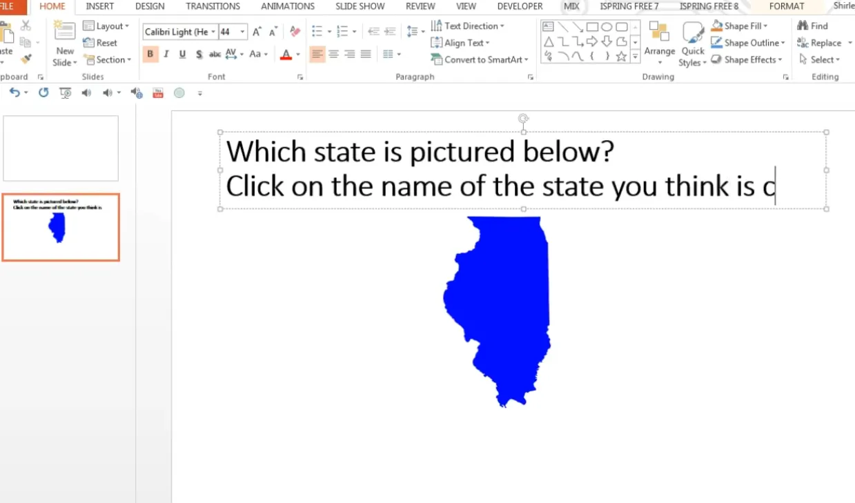
Bad feedback: “Wrong.”
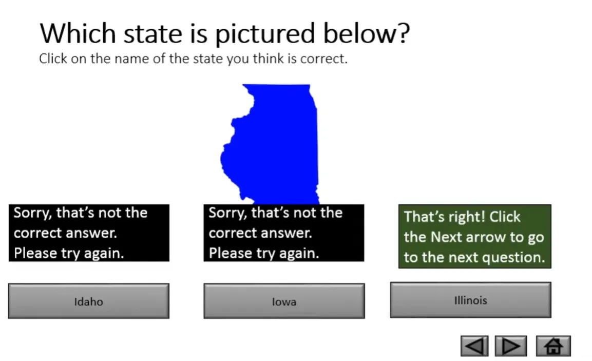
Good feedback: “Not quite. Remember that Illinois is located in the Midwest region of the United States.”
Bad feedback: “Correct.”
Good feedback: “That’s right! Mars appears red due to iron oxide (rust) on its surface.”
See the difference? Good feedback teaches. It doesn’t just validate; it explains. Even correct answers benefit from reinforcement of why they’re correct.
Retry Options
Should learners be able to try again? Usually, yes. On your “incorrect” feedback slides or shapes, include a way to return to the question. This might be a “Try Again” button that hyperlinks back to the question slide, or simply keeping the quiz on the same slide with triggers.
For high-stakes assessments, you might limit retries. But for learning and training? Let people learn from mistakes. That’s the whole point.
How to Make A Multiple Choice Assessment with OnlineExamMaker AI?
Now, let’s be honest: PowerPoint quizzes are fantastic for presentations and small-scale assessments. But what if you need to create complex exams with dozens of questions, automatic grading, detailed analytics, and the ability to distribute assessments to hundreds of people simultaneously? That’s where specialized tools like OnlineExamMaker come in.
Here’s where it gets interesting. OnlineExamMaker’s AI features can analyze your existing content—whether that’s training documents, course materials, or subject matter text—and automatically generate relevant multiple choice questions.
Create Your Next Quiz/Exam with OnlineExamMaker
The process is straightforward:
- Upload your content: Import documents, PDFs, or paste text directly into the platform
- Configure AI generation: Specify how many questions you need, difficulty level, and question types
- Review and refine: The AI generates questions with multiple answer options; you review and edit as needed
- Customize feedback: Add explanations for correct and incorrect answers
- Deploy your assessment: Share via link, embed in your LMS, or distribute through email
What would take hours in PowerPoint—crafting individual questions, creating feedback slides, testing interactions—takes minutes with AI assistance. The platform handles the heavy lifting while you focus on quality and pedagogy.
When to Use PowerPoint vs. OnlineExamMaker
Choose PowerPoint when you need:
- Integration with a live presentation
- Complete control over design and branding
- Offline capability
- Simple, small-scale knowledge checks
- Immediate, in-person feedback
Choose OnlineExamMaker when you need:
- Large-scale assessment distribution
- Automated grading and reporting
- Question randomization and security
- Detailed performance analytics
- AI-assisted question generation
- Mobile and remote access
The platforms aren’t competitors; they’re complementary. Use PowerPoint for embedded presentation quizzes and immediate classroom engagement. Use OnlineExamMaker for formal assessments, training certifications, and large-scale testing scenarios.
Best Practices and Pro Tips to Create Multiple Quizzes
Keep Questions Clear and Concise
Nobody likes a trick question, especially when they’re trying to learn. Write questions that test knowledge, not reading comprehension. Avoid double negatives (“Which of the following is NOT incorrect?”), ambiguous language, or unnecessarily complex sentence structures.
Good question: “What is the capital of France?”
Bad question: “Which city, not including those that were formerly but are no longer considered the capital, currently serves as the primary governmental seat of the French Republic?”
Balance Your Answer Options
Make all answer options plausible. If you have three obviously wrong answers and one obviously correct one, you’re not testing knowledge—you’re testing ability to identify absurdity.
For a question about chemical elements, bad distractors might be “banana” and “Tuesday.” Good distractors are other elements that might plausibly be confused with the correct answer.
Test Your Quiz Thoroughly
Before deploying to learners, click every button, trigger every animation, follow every hyperlink. Test what happens when someone clicks the wrong answer twice. Test what happens on the last question. Test on different computers if possible.
According to PPTVBA, testing accounts for about 30% of quiz development time, but prevents 100% of the embarrassing failures.
Add Navigation Hints
Tell people what to do. “Click on the correct answer” or “Select the state of Illinois” removes ambiguity. Don’t assume everyone instinctively knows to click on shapes.
Duplicate Smart
Once you have one question slide working perfectly, duplicate it (Ctrl+D) and modify the content. This is vastly more efficient than building each question from scratch. Your triggers, animations, and formatting all copy over—just change the text and adjust which answer is correct.
Consider Accessibility
Use sufficient color contrast (not light gray text on white backgrounds). Include text descriptions for images. Ensure keyboard navigation works for users who can’t use a mouse. Accessibility isn’t optional; it’s essential.
Troubleshooting Common Issues
Animations Won’t Trigger
Check three things: First, is the animation set to “On Click” of the correct shape? Open the Animation Pane and verify. Second, are you in kiosk mode during testing? Triggers won’t work in normal slideshow mode the same way. Third, is the trigger shape visible and clickable, or is something covering it?
Hyperlinks Jump to Wrong Slides
This usually happens when you duplicate slides and forget to update the hyperlinks. Each link needs to point to the correct destination. Right-click the shape, choose “Edit Link,” and verify the target slide.
Text Disappears After Animation
When you use the “Object Color” animation to change shape colors, it can sometimes hide text. The fix: add a second “Font Color” animation set to start “With Previous” that keeps the text visible in white or another contrasting color.
Can’t Exit the Quiz
In kiosk mode, random clicking doesn’t advance slides—which is exactly what we want. But you need to provide exit options. Add a “Finish” or “Exit” button on your final slide that hyperlinks to a conclusion slide, or simply instruct users to press Escape to exit.
Quiz Works on Your Computer But Not Others
This usually relates to font compatibility or image file paths. Use standard fonts (Arial, Calibri, Times New Roman) that exist on all systems. If using custom fonts, embed them via File → Options → Save → Embed fonts in the file.
Bringing It All Together
Creating multiple choice quizzes in PowerPoint isn’t rocket science, but it does require attention to detail and a clear understanding of how triggers, animations, and hyperlinks work together. The payoff? Interactive assessments that transform passive presentations into active learning experiences.
Start simple. Build one question using the hyperlink method until you understand the flow. Then experiment with triggers for the sleeker single-slide approach. Try picture-based questions when appropriate. Test everything obsessively. And remember: the goal isn’t just to quiz—it’s to teach, engage, and provide meaningful feedback.
For small-scale, presentation-embedded quizzes, PowerPoint delivers everything you need. For larger assessments requiring advanced features, AI-powered platforms like OnlineExamMaker offer the scalability and analytics that PowerPoint can’t match. Choose your tools based on your needs, but always design with the learner in mind.
Your first quiz probably won’t be perfect. That’s fine. Build it, test it, deploy it, and learn from the experience. Each quiz you create teaches you something new about both PowerPoint’s capabilities and your learners’ needs. And that education? That’s the real assessment.
Now go build something. Your learners are waiting, and they’re ready to be tested—as long as you make it interesting enough to hold their attention. You’ve got the tools. You’ve got the techniques. Time to put them to work.