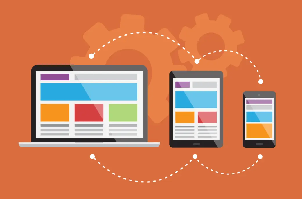
Responsive design is an approach to web development that ensures websites and applications adapt seamlessly to various screen sizes, devices, and orientations, providing an optimal viewing experience for users.
At its core, responsive design relies on three key principles:
Fluid Grids: Using relative units like percentages instead of fixed pixels to create layouts that scale proportionally. For example, a grid system divides the page into flexible columns that adjust based on the viewport width.
Flexible Images and Media: Images, videos, and other elements are scaled using CSS properties like `max-width: 100%` to prevent them from overflowing their containers and to maintain aspect ratios across devices.
Media Queries: CSS techniques that apply different styles based on device characteristics, such as screen width, height, resolution, or orientation. For instance, a media query might change a navigation menu from a horizontal bar on desktops to a hamburger icon on mobile screens.
This concept, popularized by Ethan Marcotte in 2010, addresses the challenges posed by the proliferation of devices like smartphones, tablets, and desktops. By prioritizing user experience, responsive design improves accessibility, reduces bounce rates, and enhances search engine optimization (SEO), as search engines like Google favor mobile-friendly sites.
Table of contents
- Part 1: OnlineExamMaker AI quiz generator – Save time and efforts
- Part 2: 20 responsive design quiz questions & answers
- Part 3: AI Question Generator – Automatically create questions for your next assessment
Part 1: OnlineExamMaker AI quiz generator – Save time and efforts
What’s the best way to create a responsive design quiz online? OnlineExamMaker is the best AI quiz making software for you. No coding, and no design skills required. If you don’t have the time to create your online quiz from scratch, you are able to use OnlineExamMaker AI Question Generator to create question automatically, then add them into your online assessment. What is more, the platform leverages AI proctoring and AI grading features to streamline the process while ensuring exam integrity.
Key features of OnlineExamMaker:
● Combines AI webcam monitoring to capture cheating activities during online exam.
● Allow the quiz taker to answer by uploading video or a Word document, adding an image, and recording an audio file.
● Automatically scores multiple-choice, true/false, and even open-ended/audio responses using AI, reducing manual work.
● OnlineExamMaker API offers private access for developers to extract your exam data back into your system automatically.
Automatically generate questions using AI
Part 2: 20 responsive design quiz questions & answers
or
1. What is the primary purpose of responsive design in web development?
A. To make websites load faster
B. To ensure websites adapt to different screen sizes and devices
C. To add more animations to websites
D. To improve server-side processing
Answer: B
Explanation: Responsive design uses flexible layouts, images, and CSS media queries to adjust the website’s appearance based on the device’s screen size, providing an optimal viewing experience.
2. Which CSS feature is most commonly used to apply styles based on device width in responsive design?
A. Flexbox
B. Media queries
C. Grid layout
D. Transitions
Answer: B
Explanation: Media queries allow developers to apply specific CSS rules when certain conditions, like screen width, are met, enabling the design to respond to different devices.
3. What does the viewport meta tag do in HTML for responsive design?
A. It sets the background color of the page
B. It controls the page’s scaling and dimensions on mobile devices
C. It loads external fonts
D. It optimizes image sizes
Answer: B
Explanation: The viewport meta tag, such as , ensures that the page is rendered at the device’s width and scales properly on various screens.
4. In responsive design, what is a breakpoint?
A. A point where the website crashes
B. A specific screen width where the layout changes
C. The end of a CSS file
D. A type of image format
Answer: B
Explanation: Breakpoints are predefined screen widths (e.g., 768px for tablets) where the CSS media queries trigger layout changes to accommodate different device sizes.
5. Which approach is recommended for building responsive websites to prioritize mobile users?
A. Desktop-first design
B. Mobile-first design
C. Tablet-first design
D. Server-first design
Answer: B
Explanation: Mobile-first design starts with the smallest screen sizes and adds styles for larger devices, ensuring core functionality works on mobile before enhancing for desktops.
6. What CSS unit is often used in responsive design to make elements scale relative to the font size?
A. Pixels (px)
B. Em or rem
C. Percentages (%)
D. Viewport units (vw, vh)
Answer: B
Explanation: Em and rem units are relative to the font size, allowing elements to scale proportionally when the base font size changes, which is useful for responsive typography.
7. How can flexible images be implemented in responsive design?
A. Using fixed pixel widths
B. Setting max-width: 100% in CSS
C. Avoiding images altogether
D. Using only SVG formats
Answer: B
Explanation: Setting max-width: 100% ensures images scale down on smaller screens without overflowing their containers, maintaining responsiveness.
8. What is the role of fluid grids in responsive design?
A. They create rigid layouts
B. They use percentages instead of fixed units for layout flexibility
C. They only work on desktops
D. They eliminate the need for CSS
Answer: B
Explanation: Fluid grids use relative units like percentages to adjust the layout dynamically based on the screen size, allowing elements to resize fluidly.
9. Which tool is commonly used to test responsive designs across different devices?
A. A simple text editor
B. Browser developer tools
C. A basic calculator
D. Image editing software
Answer: B
Explanation: Browser developer tools, like those in Chrome or Firefox, include device emulation features to simulate various screen sizes and orientations for testing.
10. In responsive design, what happens when a media query condition is not met?
A. The website displays an error
B. The default styles are applied
C. All styles are ignored
D. The page reloads
Answer: B
Explanation: If a media query’s conditions are not met, the browser falls back to the default CSS styles, ensuring the website remains functional.
11. Why is it important to use relative units like percentages in responsive CSS?
A. They make the code shorter
B. They allow elements to adapt to different screen sizes
C. They speed up loading times
D. They are required by web standards
Answer: B
Explanation: Relative units scale with the container or viewport, enabling layouts to adjust automatically as the screen size changes, unlike fixed units like pixels.
12. What is the difference between adaptive and responsive design?
A. Adaptive design uses fixed layouts, while responsive uses flexible ones
B. They are the same thing
C. Responsive design only works on mobile
D. Adaptive design is faster
Answer: A
Explanation: Adaptive design serves predefined layouts for specific devices, while responsive design uses fluid techniques to adapt continuously to any screen size.
13. Which HTML element is used to define different image sources for various screen sizes?
A.
B.
14. How does CSS Flexbox help in responsive design?
A. It creates static pages
B. It enables flexible alignment and distribution of space among items
C. It only works with images
D. It replaces HTML entirely
Answer: B
Explanation: Flexbox provides a way to design flexible, responsive layouts by adjusting the size and position of elements based on available space.
15. What is the purpose of the @media rule in CSS?
A. To define global styles
B. To apply styles conditionally based on device characteristics
C. To import external stylesheets
D. To animate elements
Answer: B
Explanation: The @media rule is used within CSS to include a block of styles that only apply when certain media conditions, like screen width, are true.
16. In responsive design, what should be considered when designing for high-DPI screens?
A. Using larger file sizes
B. Providing higher resolution images or assets
C. Ignoring pixel density
D. Only using text
Answer: B
Explanation: High-DPI screens require higher resolution assets to prevent blurring; techniques like using the srcset attribute help deliver appropriate images.
17. Which best practice ensures content readability on small screens in responsive design?
A. Using very small font sizes
B. Implementing touch-friendly elements and adjustable font sizes
C. Removing all text
D. Increasing page load times
Answer: B
Explanation: Touch-friendly elements (e.g., larger buttons) and responsive font sizes ensure users can interact with and read content easily on mobile devices.
18. What is the benefit of using viewport units (vw, vh) in responsive design?
A. They make elements fixed in size
B. They allow elements to scale relative to the viewport’s width or height
C. They only work on desktops
D. They eliminate the need for media queries
Answer: B
Explanation: Viewport units like vw (1% of viewport width) enable elements to resize based on the full window size, enhancing responsiveness without complex queries.
19. How can you prevent content overflow on smaller screens?
A. By using absolute positioning only
B. By setting overflow: hidden and using flexible containers
C. By avoiding CSS altogether
D. By increasing the font weight
Answer: B
Explanation: Setting overflow: hidden or using flexible layouts like Flexbox or Grid prevents content from spilling outside its container on narrow screens.
20. What is a key challenge in implementing responsive design for e-commerce websites?
A. Ensuring fast loading times across devices
B. Making sure product images and layouts adapt without losing functionality
C. Only focusing on desktop users
D. Using the same design for all pages
Answer: B
Explanation: E-commerce sites must balance visual appeal with functionality, ensuring elements like carousels and buttons work seamlessly on all devices to maintain user experience.
or
Part 3: AI Question Generator – Automatically create questions for your next assessment
Automatically generate questions using AI