Slide 1: Title Slide
– Title: PowerPoint Design Overview
– Subtitle: Best Practices for Effective Presentations
– Presenter Name: [Your Name]
– Date: [Insert Date]
Slide 2: Introduction to Design Principles
– Key elements of good design: Simplicity, Consistency, Clarity
– Purpose: Engage audience and convey message effectively
– Avoid common pitfalls: Clutter, inconsistent fonts, overwhelming colors
Slide 3: Layout and Structure
– Use a clean layout: Grid-based designs for alignment
– Slide structure: Header, Body, Footer
– Rule of thirds: Place key elements off-center for visual interest
– Limit slides: 5-7 lines per slide, 5-7 words per line
Slide 4: Color Schemes
– Choose colors wisely: Use 2-3 colors max per slide
– Psychology of colors: Blue for trust, Red for urgency
– Accessibility: Ensure high contrast for readability
– Tools: Built-in themes or tools like Adobe Color
Slide 5: Typography and Fonts
– Font selection: Sans-serif for body (e.g., Arial, Calibri)
– Font sizes: Title (24-44 pt), Body (18-24 pt)
– Consistency: Use one font family, vary weights for emphasis
– Avoid: All caps, too many font styles
Slide 6: Images and Visuals
– High-quality images: Use royalty-free sources
– Visual hierarchy: Larger images for emphasis
– Charts and graphs: Keep simple, label clearly
– Alternatives: Icons, diagrams to break up text
Slide 7: Transitions and Animations
– Use sparingly: Subtle transitions to maintain flow
– Best practices: Fade or slide, avoid flashy effects
– Timing: Align with speaking points
– Tip: Test in presentation mode
Slide 8: Best Practices for Content
– Keep it concise: Focus on key messages
– Bullet points: Use for lists, not paragraphs
– Storytelling: Structure as problem-solution or narrative
– Engagement: Include questions or polls
Slide 9: Common Mistakes to Avoid
– Overloading slides: Too much text or data
– Poor visuals: Pixelated images or mismatched styles
– Ignoring audience: Not tailoring to their needs
– Technical issues: Font embedding and file compatibility
Slide 10: Conclusion and Tips
– Recap: Apply these principles for better presentations
– Final tips: Practice delivery, get feedback, use tools like PowerPoint Designer
– Call to action: Start redesigning your slides today
– Thank you slide: Contact information and Q&A
Notes:
– Design Template: Use a professional theme with white space.
– Total Slides: 10 for brevity.
– Export: Save as .pptx for compatibility.
Table of Contents
- Part 1: Best AI Quiz Making Software for Creating A Powerpoint Design Quiz
- Part 2: 20 Powerpoint Design Quiz Questions & Answers
- Part 3: Try OnlineExamMaker AI Question Generator to Create Quiz Questions
Part 1: Best AI Quiz Making Software for Creating A Powerpoint Design Quiz
Nowadays more and more people create Powerpoint Design quizzes using AI technologies, OnlineExamMaker a powerful AI-based quiz making tool that can save you time and efforts. The software makes it simple to design and launch interactive quizzes, assessments, and surveys. With the Question Editor, you can create multiple-choice, open-ended, matching, sequencing and many other types of questions for your tests, exams and inventories. You are allowed to enhance quizzes with multimedia elements like images, audio, and video to make them more interactive and visually appealing.
Take a product tour of OnlineExamMaker:
● Create a question pool through the question bank and specify how many questions you want to be randomly selected among these questions.
● Build and store questions in a centralized portal, tagged by categories and keywords for easy reuse and organization.
● Simply copy a few lines of codes, and add them to a web page, you can present your online quiz in your website, blog, or landing page.
● Randomize questions or change the order of questions to ensure exam takers don’t get the same set of questions each time.
Automatically generate questions using AI
Part 2: 20 Powerpoint Design Quiz Questions & Answers
or
1. What is the primary purpose of a slide master in PowerPoint?
A. To add animations to slides
B. To create a consistent layout for all slides
C. To insert images and graphics
D. To record narration for the presentation
Answer: B
Explanation: The slide master allows you to define a uniform design, such as fonts, colors, and placeholders, across all slides, ensuring consistency and saving time.
2. Which design principle emphasizes balancing elements on a slide to make it visually appealing?
A. Contrast
B. Alignment
C. Symmetry
D. Repetition
Answer: C
Explanation: Symmetry creates balance by mirroring elements on either side of a central axis, making the slide feel stable and professional.
3. What is the recommended maximum number of words per slide for effective presentations?
A. 50-100 words
B. 20-30 words
C. 100-150 words
D. No limit
Answer: B
Explanation: Limiting to 20-30 words per slide focuses on key points, reduces clutter, and helps the audience concentrate on the speaker rather than reading.
4. Which color scheme is best for presentations to ensure readability for color-blind audiences?
A. Bright and bold colors
B. High-contrast colors like black and white
C. Pastel shades only
D. Red and green combinations
Answer: B
Explanation: High-contrast colors improve visibility and accessibility, as they are less likely to be problematic for individuals with color vision deficiencies.
5. In PowerPoint, what does the “Align” tool help achieve?
A. Resize objects evenly
B. Line up objects precisely
C. Add animations to objects
D. Change the font style
Answer: B
Explanation: The Align tool ensures objects are positioned accurately relative to each other or the slide edges, creating a neat and professional layout.
6. Why should you avoid using too many font styles in a single presentation?
A. It makes the file size larger
B. It can confuse the audience and disrupt flow
C. It slows down slide transitions
D. It requires more slides
Answer: B
Explanation: Limiting font styles to 2-3 maintains visual consistency and helps the audience focus on the content without distraction.
7. What is the main benefit of using themes in PowerPoint?
A. They add sound effects to slides
B. They provide a pre-designed set of colors, fonts, and layouts
C. They automatically insert charts
D. They enable real-time collaboration
Answer: B
Explanation: Themes save time by applying a cohesive design framework, ensuring all slides look polished and branded.
8. Which element should be used sparingly in presentations to avoid overwhelming the audience?
A. Bullet points
B. Animations
C. Images
D. Text boxes
Answer: B
Explanation: Overusing animations can distract from the message, so they should be subtle and purposeful to enhance, not overshadow, the content.
9. What is the purpose of the “Gridlines” feature in PowerPoint?
A. To add background patterns
B. To help align and position objects accurately
C. To create charts and graphs
D. To insert hyperlinks
Answer: B
Explanation: Gridlines act as a guide for placing elements evenly, improving the overall design and precision of the slide layout.
10. Why is it important to maintain a consistent margin around slide content?
A. To fit more text on the slide
B. To ensure content doesn’t get cut off when projected
C. To add more colors
D. To speed up presentation delivery
Answer: B
Explanation: Consistent margins prevent important elements from being hidden during projection or printing, maintaining a clean and professional appearance.
11. In PowerPoint design, what does “white space” refer to?
A. The background color of the slide
B. Empty areas that improve readability and focus
C. Text that is highlighted
D. Borders around images
Answer: B
Explanation: White space, or negative space, allows content to breathe, reducing clutter and helping the audience process information more effectively.
12. Which type of chart is best for showing trends over time?
A. Pie chart
B. Line chart
C. Bar chart
D. Scatter plot
Answer: B
Explanation: A line chart effectively illustrates changes and patterns over a period, making it ideal for time-based data in presentations.
13. What is the recommended aspect ratio for most modern presentations?
A. 4:3
B. 16:9
C. 1:1
D. 16:10
Answer: B
Explanation: The 16:9 ratio is standard for widescreen displays, providing a wider canvas that fits most projectors and screens without distortion.
14. Why should you use high-resolution images in PowerPoint slides?
A. To make the file download faster
B. To prevent pixelation and maintain quality
C. To add more colors to the image
D. To reduce the number of slides
Answer: B
Explanation: High-resolution images ensure clarity and professionalism, avoiding blurry effects that can detract from the presentation’s impact.
15. What is the role of transitions in PowerPoint design?
A. To change the font size
B. To smoothly move between slides
C. To insert audio clips
D. To duplicate slides
Answer: B
Explanation: Transitions provide a seamless flow between slides, enhancing engagement without overwhelming the audience if used moderately.
16. Which font category is generally best for body text in presentations?
A. Script fonts
B. Sans-serif fonts
C. Decorative fonts
D. Serif fonts
Answer: B
Explanation: Sans-serif fonts, like Arial or Calibri, are clean and readable on screens, making them ideal for body text in professional designs.
17. How can you enhance accessibility in PowerPoint designs?
A. By using small fonts
B. By adding alt text to images
C. By removing all colors
D. By increasing animation speed
Answer: B
Explanation: Alt text describes images for screen readers, ensuring the presentation is accessible to users with visual impairments.
18. What is the best practice for placing text on a slide with a busy background?
A. Use the same color as the background
B. Overlay a solid shape behind the text
C. Make the text very small
D. Remove the background entirely
Answer: B
Explanation: Overlaying a solid shape creates contrast, making the text legible even on complex backgrounds.
19. Why is it advisable to limit the use of all caps in slide text?
A. It makes the text too formal
B. It can be harder to read and seem shouting
C. It increases file size
D. It slows down the presentation
Answer: B
Explanation: All caps reduces readability and can feel aggressive, so using title case or sentence case improves audience comprehension.
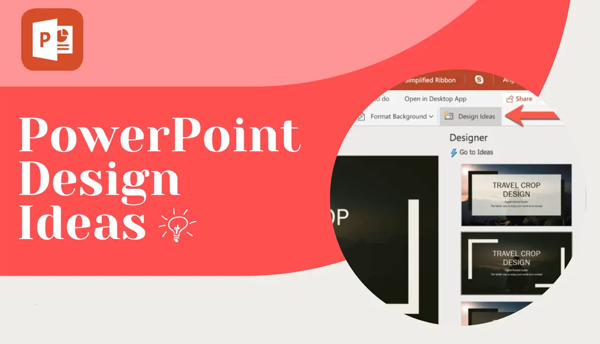
20. In PowerPoint, what does the “Design Ideas” feature primarily do?
A. Suggest layouts and styles based on content
B. Add music to slides
C. Create custom animations
D. Export the presentation
Answer: A
Explanation: Design Ideas uses AI to propose professional layouts and designs automatically, helping users enhance their slides efficiently.
or
Part 3: Try OnlineExamMaker AI Question Generator to Create Quiz Questions
Automatically generate questions using AI