Although building an academy website is a hard task, it can turn out to be a quick and easy project if done right. It could be professional courses, skill development programs, or coaching—an operation website is going to make your business reach the students easily and provide flawless learning experiences online. Let’s break down how you can create your academy website easily.
- What Is An Online Training Business? What It Is and How It Works
- The Benefits of An Academy Website for Training Institutions
- A Step-by-Step Guide to Building an Academy Website Using OnlineExamMaker
- Best Practices for Making A Great Academy Website
What Is An Online Training Business? What It Is and How It Works

Online training is a business providing courses, classes, or coaching programs to students who are remotely interested in them. The whole point is to have such pliable platforms for learning on digitized formats where students could learn at their pace or join live sessions. One can provide content in the format of video lessons, downloadable resources, quizzes, and interactive tools. You can use an academy website to showcase your courses, manage student enrollment, accept payments, and track learners’ progress—all in one place. Building an online training platform with the right tools is really more of a case of smart planning than that of technical skills. Now let’s get started, and I’ll help you navigate through the core steps of building your academy website.
The Benefits of An Academy Website for Training Institutions
Expanded reach
An academy website allows breaking from location constraints and hence offers an institution’s courses to the rest of the world. If your training is in a niche area or generally, a website puts your courses before a global audience, including some who may not reach out and contact you to learn more otherwise. By erasing the geographic borders, you extend the potential base of your students, increase the possibility of networking with others internationally, increase possible collaboration with experts in your field, and significantly increase diversity within your learning community. With this reach that transcends physical borders, many if not all these new opportunities for growth, namely partnerships and global recognition, may never be reached by a purely physical institution.
Simplified registration process
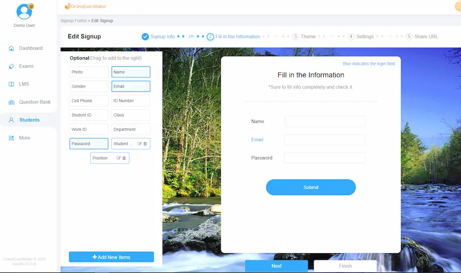
Now, enrollment doesn’t have to be done manually through registration forms, no more waiting for a long process of approval, or being puzzled with payment procedures. A website for an academy has made the entire process of registration simple and streamlined. The students can view the available courses online, register with just a click, and make payments online— all these without having to wait for the confirmation or be hassled with cumbersome paperwork. This reduces the administrative burden for your team and increases the possibility of students completing their enrollment promptly, thus raising your course registration. Automated systems also offer reminders, confirmations on payments, and up-to-the-minute updates on course availability, which assures you and your students that the process is conducted in an organized and transparent manner from start to finish.
Centralized learning hub
An academy website is analogous to a single roof under which learning activities are held and where administrative functions take place. With an academy, students can access coursework, send their assignments, and monitor their progress in one manageable location, which takes away the chances of any confusion and keeps students on the track of their learning process. This means that all the tools for course management are integrated into a single spot. With this, content can be uploaded, assignments graded, and feedback for students given with ease. This makes multiple system or platform juggling unnecessary: a smooth learning environment for instructors and students. What is more, when features like forums or discussion boards are added, the website becomes a lively learning community through which students can interact with one another and with teachers in real time.
Professional branding
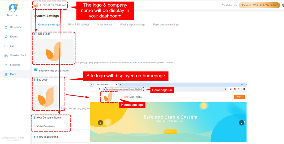
A professionally designed website is the foundation for your institution’s online brand. It is the first touchpoint for incoming students, giving them a feel for the standard of education and values practiced at your institution. As a result, your website design will go a long way in informing a visitor’s impression of your courses and institution, so you need to have a polished and consistent brand. You can enhance trust and authority through clean and user-friendly design, testimonials, and detailed course descriptions. It’s a strong brand online, not just attracting students but outshining competition, leaving your institution with a professional image and how committed you are to excellence. A high standard of content with this quality of branding really makes a difference for marketing with the website of an academy, drawing more students and building its reputation stronger in the education sector.
24/7 availability
The website for the academy can be accessed at any time, giving students a lot of flexibility in regards to when they can conduct their learning. That is beneficial to particularly busy students juggling study with work and family. Access to materials any time of day enables them to work studies into their schedules, and this will translate to high satisfaction and completion rates.
Improved student engagement
An academy website is incorporated with discussion forums, quizzes, and live chats, among others, which guarantee interaction between students and instructors. Such features introduce the needed collaboration and prompt feedback, making the learning experience more interactive and lively. With interactive environments, you can easily keep students motivated and deeply involved in their lessons.
Cost-effectiveness
Operating an online academy is generally cheaper than operating a physical space; you will save on rent, utilities, and materials expenses. Scaling up in an online academy is much easier without involving more physical resources. The flexibility of an online platform also means that saved funds can be reinvested in improving course quality, marketing, or other areas of growth.
A Step-by-Step Guide to Building an Academy Website Using OnlineExamMaker
With the following step-by-step process of building an academy website on OnlineExamMaker, ensure smooth efficiency within the process leading to a well-rounded and functional educational platform:
Create the homepage
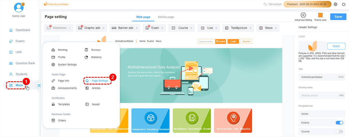
The first step is to create the homepage, as this serves as the face of your academy. A good homepage does the work of creating an identity for your academy and warmly welcomes your visitor with a strong reflection of your values and offers: your logo, a punchy tagline or mission statement, and easily navigated links to sections on your site such as Courses, Exams, and Contact Information. Also, key points like a sneak peek at upcoming courses or a few words of testimony from students who have gone before can be listed here. By centering attention on the homepage, one is already creating a professional first impression; hence, well-positioned to capture and keep visitors who are bound to be his students.
Add exams and courses
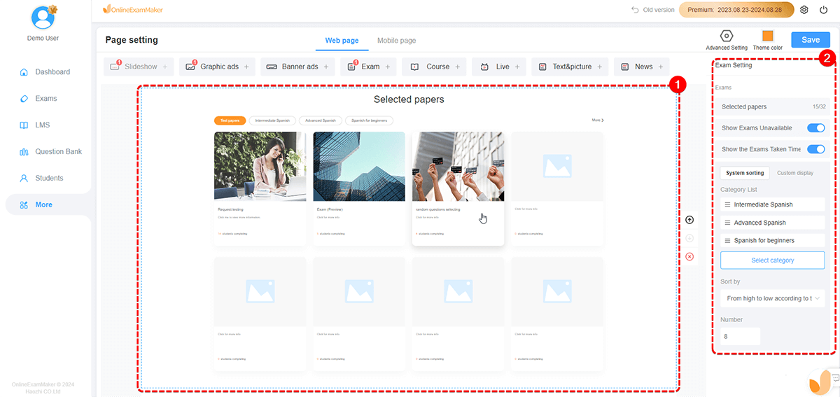
After setting up the homepage, one can proceed to add the exams and the courses constituting the underlying basic content. An exam is required for testing the learning accomplishments of the student, while the course constitutes the entire background of what the learning will be based upon. OnlineExamMaker allows creating all the various types of exams—for example, multiple choice, short answer, or essay questions. Similarly, you can structure courses with material uploaded, such as video tutorials, PDFs, and quizzes, into organized modules. Having clear curricula with structured examinations makes learning more effective and enables students to feel the sense of progress. Adding exams and courses at this stage ensures that students have access to both learning content and assessments, making your academy a fully functional educational hub.
Set up notifications
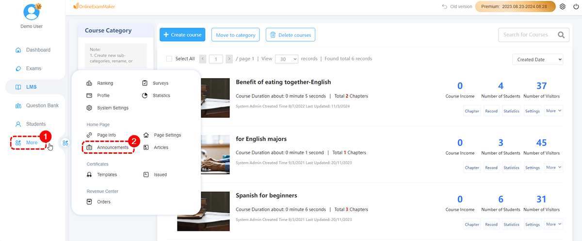
Once your courses and exams are in place, it’s important to establish a communication channel through notifications. Notifications keep your students informed about important updates, such as new course releases, upcoming exams, or changes in schedules. You are able to make notifications even more customized, where they can be emailed or appear on the dashboard for the student. Regular updates are not only able to make students feel involved but can also avoid cases where opportunities are missed or confusion created by the updates. The setting up of the notifications ensures a smooth line of communication that will place you in close reach with your student for the realization of the success of the student.
Articles
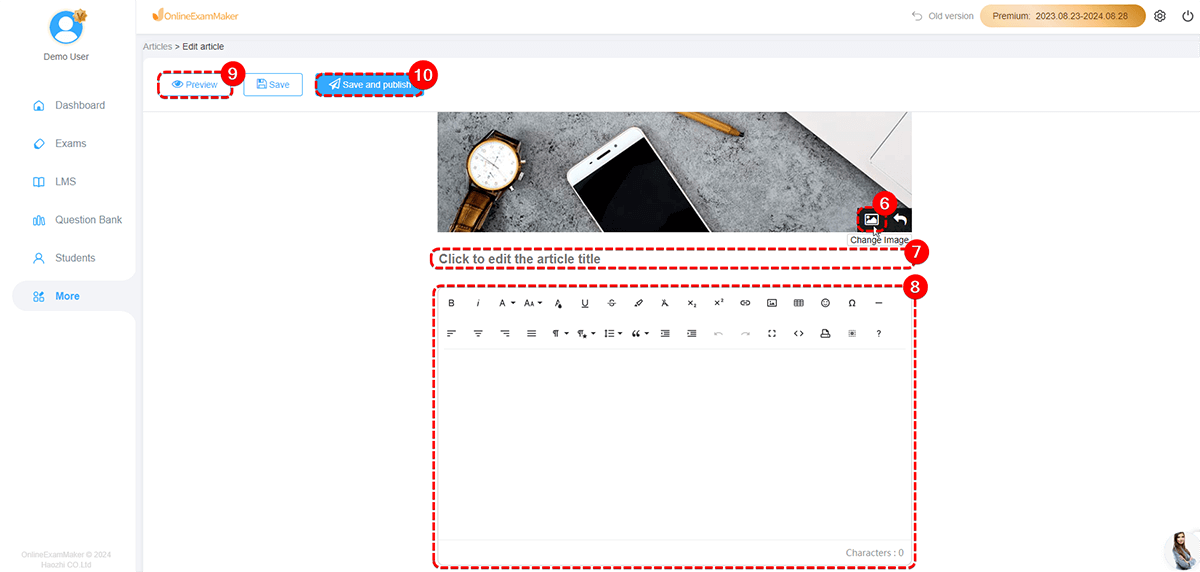
Populate articles on your academy’s website. Articles can be multi-purposed as further educational resources or new trend and development articles in the industry. Such content makes the learning process more fulfilling for the student by gaining knowledge that goes beyond the basic curriculum. Regular publication of such articles improves the SEO value for your site, so it is found for more searches for the relevant information on the topic by prospective students. Articles also give your academy an impression of a thought leader in the field, earning it some legitimacy, which therefore means more people will read them. So the inclusion of articles on your site is not just for better student experience but also to enhance traffic and engagement on your website.
Create Your Next Quiz/Exam with OnlineExamMaker
Best Practices for Making A Great Academy Website
Here are best practices in making a great academy website that will help attract and retain students, improve user experience, and build trust in your academy as a source of quality education:
User-Friendly navigation
Ensure that your website has a clear and intuitive navigation structure. The homepage should have the menus so that it is easy for the users to navigate to the important sections of courses, exams, articles, and contact information. Use drop-down menus or sidebar navigation if necessary, but don’t overcomplicate it; avoid overwhelming the user with too many choices. A simplified navigational layout will enhance the overall user experience and keep visitors on your site longer.
Fully responsive, mobile-friendly design
Your website should be fully responsive to any screen size, including tablets and smartphones. Since a majority of users have access to your site on mobile devices, you will wish to provide a smooth experience no matter the device they use. Responsiveness ensures an easily accessible mobile-friendly design that, in turn, encourages more users to interact with your courses, quizzes, or other content.
Engaging homepage
Your homepage is the first point of contact with potential students, so it has to be attention-grabbing. Use strong visual elements—high-quality images or videos—with short and clear messages to define what it is that the academy is actually offering. Highlight important information such as upcoming courses, testimonials, and student success stories. Put in call-to-action buttons that navigate users through course or exam registration.
Strong course and exam content
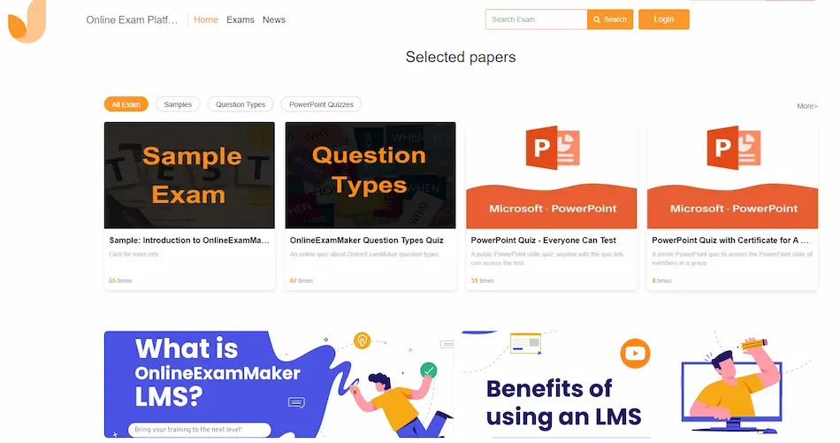
The quality of educational content is the heart of any academy website. Ensure your courses and exams are well-structured, engaging, and resonant with the needs of students. Use multimedia: videos, infographics, and interactive quizzes to make it more alive. Provide downloadable resources like PDFs or worksheets to give something extra. Second, make the examinations tough, but fair and give immediate feedback so students can learn from their mistakes.
Optimize for Speed
A very irritating quality of a website is when it’s slow. Make sure your site is optimized for speed, whereby images are compressed, code is minimized, and different caching technologies are leveraged. Use tools like Google PageSpeed Insights to test your website’s loading times and make improvements. Fast-loading pages keep visitors engaged and prevent high bounce rates.
Consistent branding
Your website should have a consistent look and feel that reflects your academy’s brand. Use color schemes, typography, and logos in line with your brand identity. The consistent branding across your site will help to create a professional image and make your academy more memorable.
Add student support and FAQs
Incorporate a student support section or live chat function through which students can ask questions and troubleshoot issues they may be facing. A well-organized FAQ section will also help to alleviate the most common questions with ease, saving time on customer service and making the users more satisfied overall.