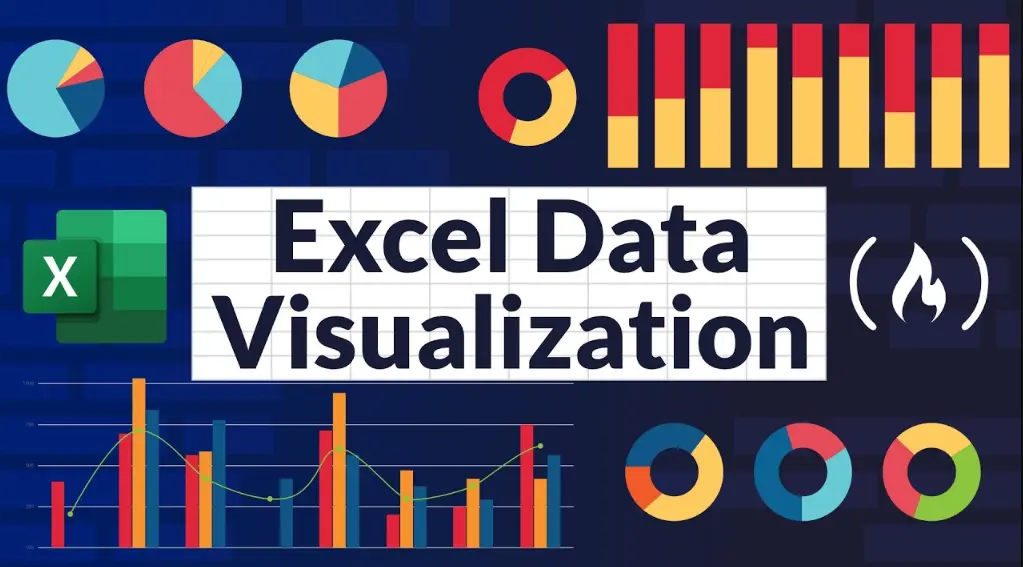
Excel offers powerful tools for data visualization, transforming raw data into insightful charts and graphs. Here’s a comprehensive overview:
Key Features
– Charts and Graphs: Excel supports various chart types, including bar, line, pie, scatter, and area charts. These help in identifying trends, patterns, and outliers quickly.
– PivotCharts: Combine the flexibility of PivotTables with charts to summarize and visualize large datasets dynamically.
– Sparklines: Small, inline charts within cells that provide a quick visual summary of data trends without creating a full chart.
– Conditional Formatting: Use color scales, data bars, and icon sets to visually highlight important data points based on rules.
– 3D Maps and Power Maps: For geographical data, these tools create interactive 3D visualizations, ideal for location-based analysis.
– Slicers and Timelines: Enhance interactivity in dashboards by allowing users to filter data visually.
How to Get Started
1. Select Data: Highlight the range of cells containing your data.
2. Insert Chart: Go to the “Insert” tab, choose a chart type, and Excel will generate a basic visualization.
3. Customize: Use the “Chart Tools” to adjust elements like titles, axes, colors, and layouts for better readability.
4. Add Interactivity: Incorporate slicers or filters to make your visualization dynamic and user-friendly.
Best Practices
– Choose the Right Chart: Match the chart type to your data—e.g., use line charts for trends over time and bar charts for comparisons.
– Keep it Simple: Avoid clutter by limiting colors, labels, and elements; focus on the story your data tells.
– Ensure Accuracy: Always verify data sources and scales to prevent misleading visualizations.
– Use Themes: Apply consistent themes for a professional look across multiple charts.
– Test on Different Devices: Ensure your visualizations are responsive and clear on various screen sizes.
Advanced Tips
– Combine with Power BI: Integrate Excel with Power BI for more sophisticated visualizations and sharing options.
– Automate with VBA: Use macros to automate repetitive visualization tasks for efficiency.
– Data Cleaning First: Before visualizing, clean your data to remove errors and inconsistencies for reliable insights.
Data visualization in Excel not only aids in analysis but also in communicating findings effectively to stakeholders. By leveraging these tools, users can turn complex data into actionable intelligence.
Table of Contents
- Part 1: Create A Excel Data Visualization Quiz in Minutes Using AI with OnlineExamMaker
- Part 2: 20 Excel Data Visualization Quiz Questions & Answers
- Part 3: OnlineExamMaker AI Question Generator: Generate Questions for Any Topic
Part 1: Create A Excel Data Visualization Quiz in Minutes Using AI with OnlineExamMaker
Are you looking for an online assessment to test the Excel Data Visualization skills of your learners? OnlineExamMaker uses artificial intelligence to help quiz organizers to create, manage, and analyze exams or tests automatically. Apart from AI features, OnlineExamMaker advanced security features such as full-screen lockdown browser, online webcam proctoring, and face ID recognition.
Recommended features for you:
● Includes a safe exam browser (lockdown mode), webcam and screen recording, live monitoring, and chat oversight to prevent cheating.
● Enhances assessments with interactive experience by embedding video, audio, image into quizzes and multimedia feedback.
● Once the exam ends, the exam scores, question reports, ranking and other analytics data can be exported to your device in Excel file format.
● Offers question analysis to evaluate question performance and reliability, helping instructors optimize their training plan.
Automatically generate questions using AI
Part 2: 20 Excel Data Visualization Quiz Questions & Answers
or
1. Question: Which type of chart is most suitable for showing the distribution of a dataset?
Options: A) Pie chart
B) Bar chart
C) Histogram
D) Line chart
Answer: C) Histogram
Explanation: A histogram is specifically designed to show the frequency distribution of numerical data, making it ideal for visualizing how data points are spread out.
2. Question: In Excel, what is the primary purpose of a pivot chart?
Options: A) To create static images
B) To summarize and analyze large datasets interactively
C) To perform basic calculations like sum and average
D) To insert images into spreadsheets
Answer: B) To summarize and analyze large datasets interactively
Explanation: Pivot charts allow users to dynamically summarize and visualize data from pivot tables, enabling quick analysis and pattern identification.
3. Question: Which Excel feature can be used to highlight data trends within a single cell?
Options: A) Conditional formatting
B) Sparklines
C) Data bars
D) Pivot tables
Answer: B) Sparklines
Explanation: Sparklines are mini charts embedded in cells that provide a quick visual representation of data trends, such as lines or bars, without taking up much space.
4. Question: What does the ‘X-axis’ represent in a scatter plot in Excel?
Options: A) The dependent variable
B) The independent variable
C) Both axes equally
D) Time series data
Answer: B) The independent variable
Explanation: In a scatter plot, the X-axis typically represents the independent variable, which is plotted against the dependent variable on the Y-axis to show relationships.
5. Question: How can you change the chart type in Excel after it’s been created?
Options: A) Right-click the chart and select ‘Change Chart Type’
B) Go to Insert > Charts and select a new type
C) Use the Format tab to switch types
D) Edit the data source directly
Answer: A) Right-click the chart and select ‘Change Chart Type’
Explanation: Right-clicking the chart and choosing ‘Change Chart Type’ from the context menu allows users to easily switch to a different visualization style.
6. Question: Which chart is best for comparing parts of a whole?
Options: A) Line chart
B) Pie chart
C) Bar chart
D) Area chart
Answer: B) Pie chart
Explanation: A pie chart effectively shows the proportion of each category relative to the whole, making it useful for displaying percentages or fractions.
7. Question: In Excel, what is the function of the ‘Quick Analysis’ tool?
Options: A) To format cells only
B) To insert formulas automatically
C) To preview and apply charts, tables, and sparklines
D) To sort data alphabetically
Answer: C) To preview and apply charts, tables, and sparklines
Explanation: The Quick Analysis tool provides instant options to visualize data with charts or add formatting, speeding up the data analysis process.
8. Question: What type of visualization is a combo chart in Excel?
Options: A) A single chart type
B) A chart that combines two or more chart types
C) A 3D representation only
D) A static image without data
Answer: B) A chart that combines two or more chart types
Explanation: A combo chart merges different chart types, like a line and a column chart, to display multiple data series effectively on the same graph.
9. Question: How do you add a trendline to a chart in Excel?
Options: A) Select the chart and go to Insert > Trendline
B) Right-click the data series and choose ‘Add Trendline’
C) Use the Design tab and select ‘Trendline’
D) Format the axis directly
Answer: B) Right-click the data series and choose ‘Add Trendline’
Explanation: Right-clicking on the data series in the chart and selecting ‘Add Trendline’ allows users to forecast trends based on existing data points.
10. Question: Which Excel tool is used for creating interactive dashboards?
Options: A) Slicers
B Pivot tables
C Conditional formatting
D Data validation
Answer: A) Slicers
Explanation: Slicers provide an interactive way to filter data in pivot tables or charts, making it easier to build dynamic dashboards for data exploration.
11. Question: What is the main advantage of using a stacked bar chart?
Options: A) It shows individual data points only
B It displays the composition of categories over time
C It is best for geographical data
D It simplifies complex calculations
Answer: B) It displays the composition of categories over time
Explanation: A stacked bar chart breaks down each bar into sub-components, allowing users to see how parts contribute to the whole across different categories.
12. Question: In Excel, how can you ensure a chart updates automatically when data changes?
Options: A) By locking the chart
B By using dynamic ranges in the data source
C By converting to a static image
D By hiding the data
Answer: B) By using dynamic ranges in the data source
Explanation: Setting up dynamic named ranges for the chart’s data source ensures that the chart refreshes automatically as new data is added or existing data is modified.
13. Question: Which chart type is ideal for showing correlations between two variables?
Options: A) Pie chart
B Scatter plot
C Line chart
D Bar chart
Answer: B) Scatter plot
Explanation: A scatter plot plots pairs of values to reveal patterns, trends, or correlations between two variables, such as strength and flexibility in materials.
14. Question: What does the ‘Explode’ feature do in a pie chart?
Options: A) Removes a slice
B Pulls out a slice for emphasis
C Changes the chart color
D Adds labels automatically
Answer: B) Pulls out a slice for emphasis
Explanation: The ‘Explode’ feature offsets a specific slice from the rest of the pie, highlighting it to draw attention to important data segments.
15. Question: In Excel, how do you create a secondary axis for a chart?
Options: A) Select the series and go to Format > Secondary Axis
B Use the Insert tab to add a new chart
C Right-click the axis and choose ‘Add Secondary Axis’
D Apply conditional formatting
Answer: C) Right-click the axis and choose ‘Add Secondary Axis’
Explanation: Right-clicking the series or axis and selecting ‘Add Secondary Axis’ allows for plotting different data scales on the same chart.
16. Question: Which visualization tool in Excel is best for time-based data sequences?
Options: A) Bar chart
B Line chart
C Pie chart
D Radar chart
Answer: B) Line chart
Explanation: Line charts are optimized for displaying data points over a timeline, making trends and changes over time easy to observe.
17. Question: What is the purpose of data labels in Excel charts?
Options: A) To decorate the chart
B To display exact values on data points
C To change the chart title
D To add borders
Answer: B) To display exact values on data points
Explanation: Data labels provide precise numerical values directly on the chart elements, enhancing readability and accuracy in data interpretation.
18. Question: How can you customize the colors in an Excel chart?
Options: A) Use the Home tab for global changes
B Select the chart and use the Format tab to change series colors
C Insert a new theme
D Apply data validation
Answer: B) Select the chart and use the Format tab to change series colors
Explanation: The Format tab offers options to modify the fill, outline, and other visual properties of chart elements, allowing for personalized color schemes.
19. Question: Which Excel feature helps in visualizing data hierarchies, like organizational structures?
Options: A) Tree maps
B Sunburst charts
C Both A and B
D Line charts
Answer: C) Both A and B
Explanation: Tree maps and sunburst charts are designed to display hierarchical data, with tree maps using nested rectangles and sunburst using concentric rings.
20. Question: What is the key benefit of using 3D charts in Excel?
Options: A) They provide more accurate data
B They add a visual depth for better representation of complex data
C They reduce file size
D They are faster to load
Answer: B) They add a visual depth for better representation of complex data
Explanation: 3D charts enhance visualization by adding perspective, making it easier to perceive layers and dimensions in multifaceted datasets.
or
Part 3: OnlineExamMaker AI Question Generator: Generate Questions for Any Topic
Automatically generate questions using AI