Excel charts are powerful visual tools for representing data trends, comparisons, and distributions. Here’s a breakdown of key chart types, creation steps, and best practices:
Common Chart Types
– Bar Charts: Ideal for comparing quantities across categories. Use for discrete data like sales by region.
– Line Charts: Show trends over time, such as stock prices or population growth. Connect data points with lines for smooth visualization.
– Pie Charts: Display proportions of a whole, like market share percentages. Effective for categorical data up to 7 slices.
– Column Charts: Similar to bar charts but vertical, great for time-based comparisons like monthly revenue.
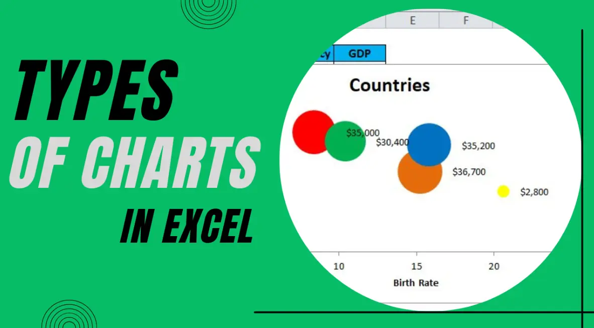
– Scatter Plots: Reveal relationships between two variables, such as height vs. weight, to identify correlations.
– Area Charts: Highlight cumulative data over time, like stacked totals of expenses.
– Pie of Pie or Bar of Pie: Break down a pie chart slice into a secondary chart for detailed subcategories.
– Combo Charts: Combine two chart types, e.g., line and column, for multi-series data like sales volume and profit.
Creating Charts in Excel
1. Select your data range in the worksheet.
2. Go to the “Insert” tab on the ribbon.
3. Choose the desired chart type from the “Charts” group.
4. Customize the chart by right-clicking elements:
– Add titles, labels, and axes via the “Chart Design” or “Format” tabs.
– Adjust data series in the “Select Data” dialog.
– Apply themes or colors for better readability.
5. Use the “Quick Analysis” tool (right-click data and select) for one-click chart suggestions.
Best Practices for Effective Charts
– Keep it Simple: Limit data points to avoid clutter; use filters for large datasets.
– Choose the Right Type: Match the chart to your data—e.g., use line charts for trends, bar for comparisons.
– Label Clearly: Always include axis titles, data labels, and a legend for easy interpretation.
– Use Colors Wisely: Opt for contrasting colors and avoid red-green for accessibility.
– Add Context: Include a chart title and source notes to explain what the data represents.
– Test for Accuracy: Double-check that the chart reflects the data correctly and scales are appropriate.
– Interactive Features: For advanced use, add slicers or pivot charts in Excel to make dashboards dynamic.
By leveraging these charts, you can transform raw data into actionable insights for reports, presentations, and analysis.
Table of Contents
- Part 1: OnlineExamMaker AI Quiz Generator – Save Time and Efforts
- Part 2: 20 Excel Charts Quiz Questions & Answers
- Part 3: OnlineExamMaker AI Question Generator: Generate Questions for Any Topic
Part 1: OnlineExamMaker AI Quiz Generator – Save Time and Efforts
What’s the best way to create a Excel Charts quiz online? OnlineExamMaker is the best AI quiz making software for you. No coding, and no design skills required. If you don’t have the time to create your online quiz from scratch, you are able to use OnlineExamMaker AI Question Generator to create question automatically, then add them into your online assessment. What is more, the platform leverages AI proctoring and AI grading features to streamline the process while ensuring exam integrity.
Key features of OnlineExamMaker:
● Combines AI webcam monitoring to capture cheating activities during online exam.
● Allow the quiz taker to answer by uploading video or a Word document, adding an image, and recording an audio file.
● Automatically scores multiple-choice, true/false, and even open-ended/audio responses using AI, reducing manual work.
● OnlineExamMaker API offers private access for developers to extract your exam data back into your system automatically.
Automatically generate questions using AI
Part 2: 20 Excel Charts Quiz Questions & Answers
or
Question 1:
What type of chart is best suited for showing trends over time, such as monthly sales data?
A) Pie chart
B) Bar chart
C) Line chart
D) Scatter plot
Answer: C
Explanation: A line chart is ideal for displaying data trends over time because it connects data points with lines, making it easy to see changes and patterns.
Question 2:
In Excel, how do you insert a chart?
A) Go to Insert > Chart and select the type
B) Use the Format tab to add a chart
C) Right-click on data and select “Chart”
D) Go to File > New > Chart
Answer: A
Explanation: The Insert tab in Excel has a Charts group where you can select and insert various chart types directly from your data.
Question 3:
Which chart type is used to compare parts of a whole, like market share percentages?
A) Column chart
B) Pie chart
C) Area chart
D) Radar chart
Answer: B
Explanation: A pie chart represents data as slices of a circle, effectively showing proportions and how individual parts make up a whole.
Question 4:
What does the ‘X-axis’ represent in most Excel charts?
A) The dependent variable
B) The independent variable
C) The legend
D) The data labels
Answer: B
Explanation: The X-axis typically represents the independent variable, such as categories or time periods, while the Y-axis shows the dependent variable.
Question 5:
How can you change the chart type after it’s created in Excel?
A) Double-click the chart and select a new type from the ribbon
B) Right-click the chart and choose “Change Chart Type”
C) Both A and B
D) You cannot change it once created
Answer: C
Explanation: You can change the chart type by either double-clicking the chart to access the Chart Tools or by right-clicking and selecting “Change Chart Type” from the context menu.
Question 6:
In a bar chart, what orientation do the bars typically have?
A) Horizontal
B) Vertical
C) Diagonal
D) Circular
Answer: B
Explanation: In a standard bar chart, bars are vertical, representing categories on the X-axis and values on the Y-axis for easy comparison.
Question 7:
What is the purpose of a legend in an Excel chart?
A) To show the scale of the axes
B) To explain the colors or patterns used for different data series
C) To display data labels
D) To add a title to the chart
Answer: B
Explanation: A legend identifies the different data series in the chart by matching colors, patterns, or symbols, helping users understand what each represents.
Question 8:
Which Excel chart is suitable for showing relationships between two numerical variables?
A) Pie chart
B) Scatter plot
C) Line chart
D) Histogram
Answer: B
Explanation: A scatter plot displays points based on two variables, allowing users to identify correlations, trends, or clusters in the data.
Question 9:
How do you add data labels to a chart in Excel?
A) Select the chart and go to Chart Tools > Add Data Labels
B) Right-click the data series and choose “Add Data Labels”
C) Both A and B
D) You must manually type them in
Answer: C
Explanation: Data labels can be added via the Chart Tools on the ribbon or by right-clicking the data series, providing values directly on the chart for clarity.
Question 10:
What happens if you select non-adjacent cells when creating a chart in Excel?
A) Excel will not create the chart
B) The chart will include only the first selected range
C) Excel can include multiple ranges in the chart
D) The chart will automatically adjust to adjacent cells
Answer: C
Explanation: Excel allows you to select non-adjacent cells or ranges when creating a chart, enabling you to plot multiple data sets together.
Question 11:
Which chart type is essentially a line chart with the area under the line filled?
A) Bar chart
B) Area chart
C) Column chart
D) Pie chart
Answer: B
Explanation: An area chart builds on a line chart by filling the space beneath the lines, emphasizing the magnitude of values over time or categories.
Question 12:
In Excel, how can you switch the rows and columns in a chart?
A) Go to Chart Design > Switch Row/Column
B) Edit the data source manually
C) Both A and B
D) It is not possible
Answer: C
Explanation: You can switch rows and columns using the Switch Row/Column button in the Chart Design tab, or by adjusting the data source in the Select Data dialog.
Question 13:
What is a combo chart in Excel?
A) A chart with only one series
B) A chart combining two or more chart types, like line and bar
C) A chart with multiple legends
D) A pie chart with additional data
Answer: B
Explanation: A combo chart overlays different chart types (e.g., line and column) on the same graph, useful for comparing different data types effectively.
Question 14:
How do you format the axes in an Excel chart?
A) Right-click the axis and select “Format Axis”
B) Use the Chart Tools > Format tab
C) Both A and B
D) Axes cannot be formatted
Answer: C
Explanation: You can format axes by right-clicking them for options or using the Format tab in Chart Tools to adjust scales, labels, and appearances.
Question 15:
Which option allows you to add a trendline to a chart in Excel?
A) Chart Tools > Design > Add Trendline
B) Right-click the data series and select “Add Trendline”
C) Both A and B
D) Trendlines are automatic
Answer: C
Explanation: Trendlines can be added via the Chart Tools ribbon or by right-clicking a data series, helping to show patterns or forecasts in the data.
Question 16:
What does a histogram chart in Excel display?
A) Frequency distribution of data
B) Pie slices of categories
C) Line trends over time
D) Scatter points of variables
Answer: A
Explanation: A histogram shows the frequency distribution of a dataset, grouping data into bins to visualize how often values occur within ranges.
Question 17:
In Excel, how can you move a chart to a new worksheet?
A) Drag it to the worksheet tab
B) Go to Chart Tools > Move Chart and select a new sheet
C) Right-click the chart and choose “Move to New Sheet”
D) Both B and C
Answer: D
Explanation: You can move a chart to a new worksheet using the Move Chart option in Chart Tools or by right-clicking the chart, which embeds it as a separate object.
Question 18:
What is the main advantage of using a stacked bar chart?
A) It shows individual values only
B) It displays the composition of each category as well as totals
C) It is best for time-based data
D) It avoids using colors
Answer: B
Explanation: A stacked bar chart breaks down each bar into segments, showing how parts contribute to the whole while also comparing totals across categories.
Question 19:
How do you apply a filter to data in an Excel chart?
A) Use the Filter button on the Data tab
B) Charts do not support filters
C) Select the chart and use the Chart Filters option
D) Manually hide data series
Answer: C
Explanation: The Chart Filters option, accessed by clicking the funnel icon on the chart, allows you to filter which data series or categories are displayed.
Question 20:
Which Excel feature helps in creating a chart with real-time data updates?
A) PivotTable
B) Dynamic charts using tables or named ranges
C) Static data only
D) Formulas in charts
Answer: B
Explanation: Using Excel tables or named ranges makes charts dynamic, so they automatically update when new data is added to the source range.
or
Part 3: OnlineExamMaker AI Question Generator: Generate Questions for Any Topic
Automatically generate questions using AI